The BIG book of mobile in-app messaging
はじめに
Using in-app messages to perfect your mobile app experience
What do submitting an expense report, tracking a package, and ordering takeout all have in common? They can all be done with a swipe or click in a mobile application.
While it’s convenient for users that there’s a mobile app for nearly every task they need to complete, the pressure is on for companies to deliver seamless, intuitive, and delightful experiences inside these applications. When an app is clunky or difficult to use, it’s easy for people to quickly leave (or even delete it), move on, and find an alternative.
Aside from building a great product in the first place, there are things you can do to improve the way users experience your mobile app—and it all starts with communication.
Instead of sending customers emails or newsletters with tips and updates about your app, why not deliver these messages inside the app itself? By delivering in-app communication that is in context and relates to what the user is doing, you’re able to create a delightful experience that is genuinely valuable. For example, what better way to welcome new users than with a guided walkthrough of the app that highlights the key features they should know about?
When it comes to in-app messaging, the possibilities are near endless. This guide features six of the most common use cases for mobile in-app guides with examples and best practice for each. Use it as inspiration, pick and choose the methods that make sense for your business, and, above all, think through how you can create a better experience for your mobile users.
1. Customer communication
When you need to reach your customers right away, you should leverage the most powerful communication channel already at your disposal: your application. Here are some types of one-off customer communications that are perfect delivered as an in-app guide:
Terms of service
An effective way to make your app’s terms of service easily accessible is through a button that triggers a popup message that shows the full terms. This way, users only see the message if they activate it by clicking, which helps ensure you aren’t overcrowding the interface with too much information. This is also a huge time saver for your team—instead of using engineering time to make changes to terms and conditions, you can simply use an in-app guide.
Urgent communications
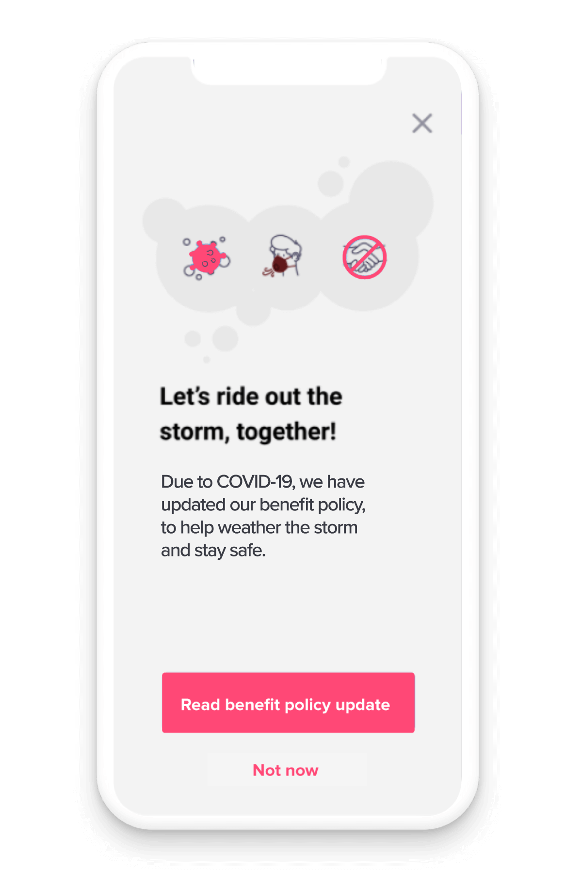
The COVID-19 pandemic was the ultimate test of being able to adapt to change, and do so quickly. While no company can plan for this level of disruption, having a way to communicate with customers immediately is key. You can use in-app guides to inform users of any updates, how your operations may be changing, or where they can get more information. Bringing this type of communication in-app will help ensure important information doesn’t get lost in inboxes or communicated too late by a member of your team.
Service is temporarily unavailable
If a certain part of your application is under construction or you experience a sudden outage, create an in-app guide (e.g. that’s triggered when someone lands in a certain part of the app or when an outage occurs) to explain what’s going on. Even if you don’t know when the issue will be resolved, your customers will appreciate the transparency and having as much information that they can.
Best practices:
- Think about whether the message you need to deliver to customers should be “always on,” or require the users themselves to trigger the information by clicking a button.
- For certain types of customer communications, it might make sense to omit having a “close” button on the guide, for example if there is an outage and you don’t want users accessing a certain area of the app.
- If you have a lot of resources to offer users, consider using an in-app guide to link out to a hub page that houses this information all in one place.
2. Feature announcement and adoption
It’s important to monitor engagement with your app and make sure customers aren’t just engaging in general, but engaging with the right features. You can use in-app guides to promote new features and increase awareness of existing features that aren’t seeing as high of usage levels as you’d like. Here are four types of guides to consider:
New feature announcement tooltip
For smaller releases where you don’t want to create a full popup or walkthrough, utilize tooltips to provide more subtle messages about new features. Tooltips are in-app messages that appear when users navigate to a specific area or perform a certain action in the product.
New feature announcement popup / walkthrough
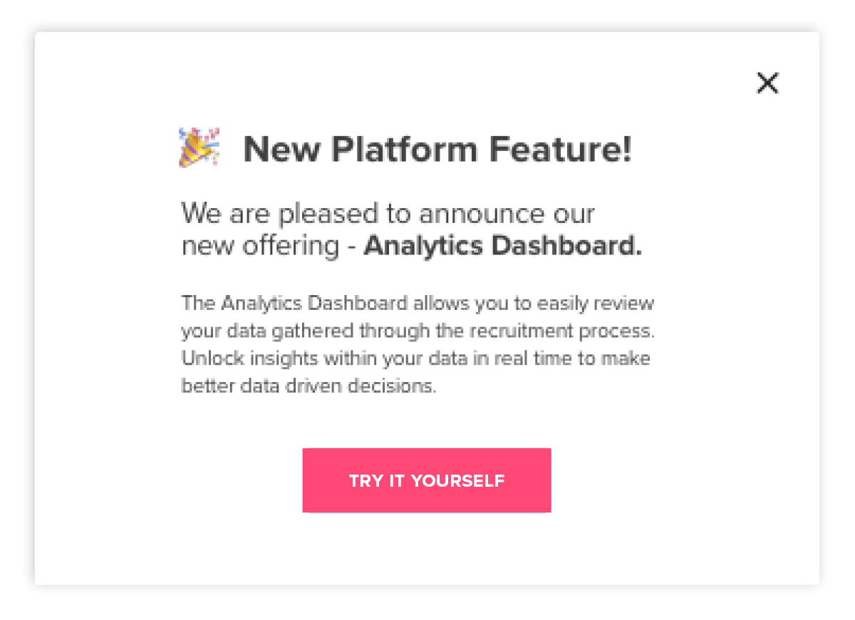
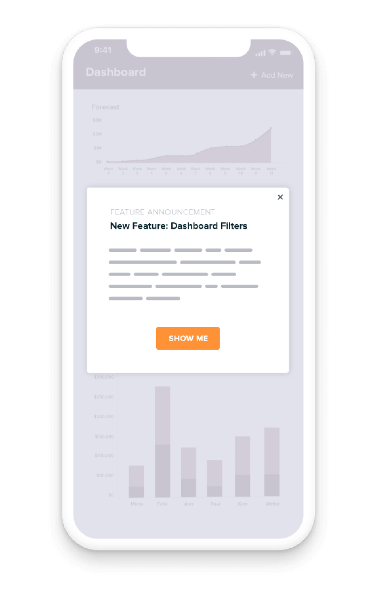
If you’re releasing a big feature that you want all of your users to know about, consider using a guide popup to grab their attention and make the feature announcement front and center. To take it one step further, create a multi-step tour that walks users through the new feature and how to use it. This will help your users get to value—fast.
New feature announcement carousel
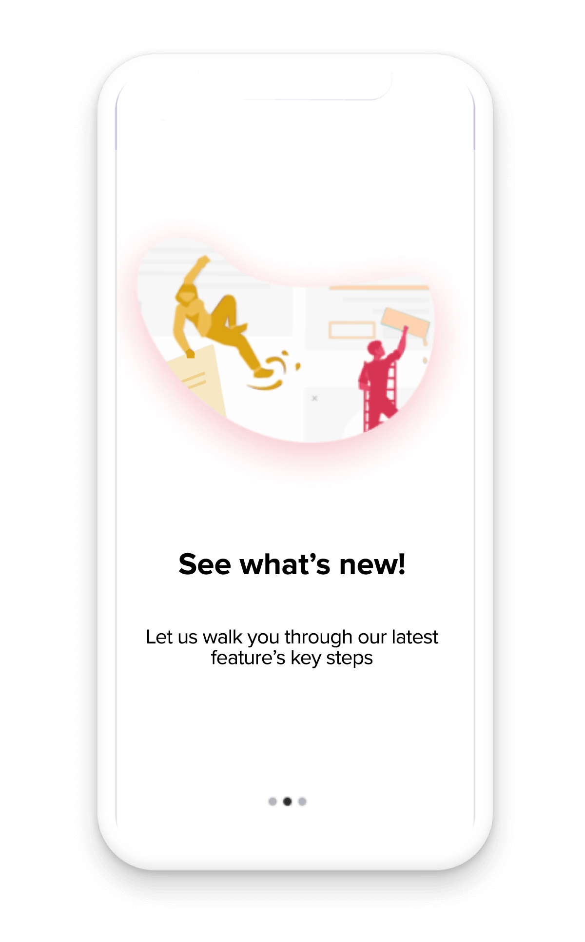
For important releases, a carousel announcement can help capture the attention of your users. A carousel is a full screen, multi-step guide with a smooth, swipe gesture between the steps. They are very eye-catching and are especially effective when combined with text that lays out the new feature’s high-level benefits.
Feature adoption tooltip
Similar to when you release a new feature, you can leverage tooltips to remind users of existing features and functionality for which you’re looking to drive adoption. This is especially helpful in not overwhelming users with too much information at once, or distracting them from their existing workflows inside your app.
Best practices:
- If you create a feature announcement popup or walkthrough, include a button that takes users directly to the new feature via a link to that specific part of your app.
- To increase adoption of existing but under-utilized features, use product analytics to first determine which users aren’t engaging with those features so you can target your in-app guides accordingly.
- If you’re not sure why users aren’t adopting a particular feature, create a poll to understand sentiment and capture feedback to better understand where the issue lies.
3. App version changes
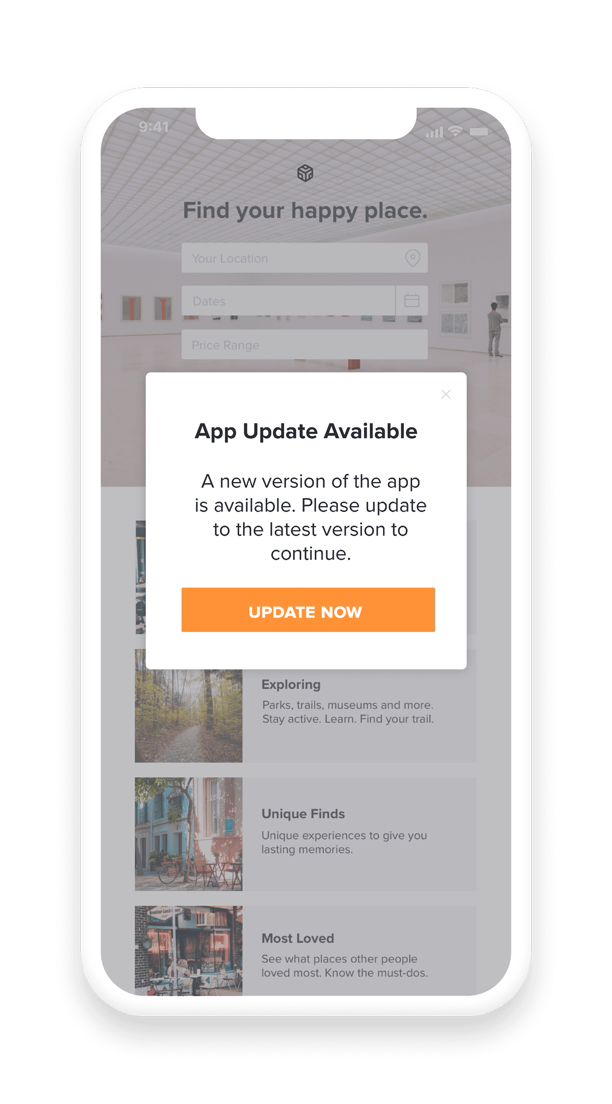
Getting users to upgrade to your latest app version is no easy feat. Use in-app messaging to build reminders into the application that also explain why they are better off on the latest version. Upgrading means customers will have a better experience with your app since they’ll have access to all of the latest bug fixes and product improvements. Here are two different types of guides to consider:
Upgrade app version
Use popups to let users know (and consistently remind them) that there is a new version of your app and encourage them to upgrade. Even better: target only those users who are still on your old app version. In the rare case that you have to move users to a new app version due to a security concern, you can communicate this in your guides to give context behind the urgency and forced change.
Sunset an app version
When getting ready to sunset an app version, start by notifying anyone who is still using it that you intend to sunset the app version they are currently using. If you need to, you can also follow up with a guide that doesn’t have an option to dismiss or close it that forces users to upgrade to the latest version.
Best practices:
- When you launch a new version of your app, don’t release all of your guides at once—space them out so you don’t disrupt users’ workflows.
Always be sure to explain the benefits of the new app version to motivate users to upgrade. - If you have the ability, utilize a “snooze” option so users can choose to view a guide at a later time when it’s more convenient for them. Adding these options for customers puts them in control and ultimately creates a better upgrade experience.
- Make sure that in-app guides asking users to upgrade their app version have a clear call to action; one of the guide buttons should take the customer straight to the appropriate app store so they can upgrade quickly.
4. Onboarding
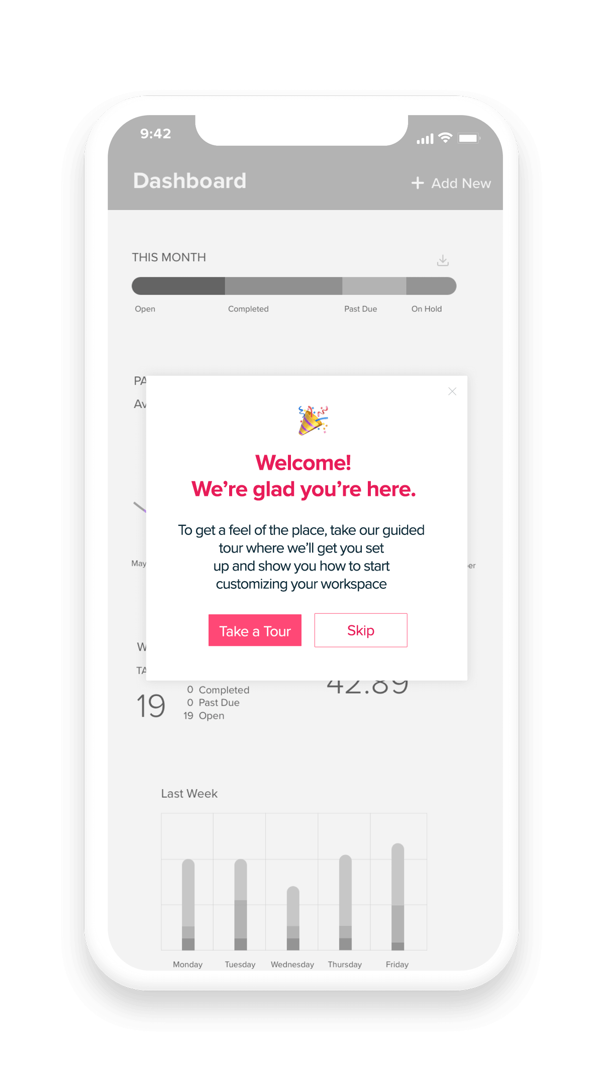
Onboarding happens whether the experience is managed or not. In order to ensure new users get value from the application as soon as possible, teams should deliver onboarding in-app. You can use a variety of guide types to provide contextual information to new users as they navigate the app, and help them utilize the functionality that’s most relevant to them. Here are four types of onboarding guides you could leverage:
Interactive walkthrough
With this method, guide new users through key workflows in your app using a combination of popups and interactive tooltips. You can also use lightboxes to expose users to the most important areas and actions, for example by darkening the rest of the app to highlight a single feature. Additionally, contextual onboarding allows you target users based on where they are in their journey to ensure your messages are relevant and helpful (rather than showing all users the same in-app guides).
User-initiated onboarding
This lets users control when they get help during onboarding. Simply add a “Need help?” button or banner to your app that when clicked, launches a guide with a walkthrough or tutorial about a particular app feature or area.
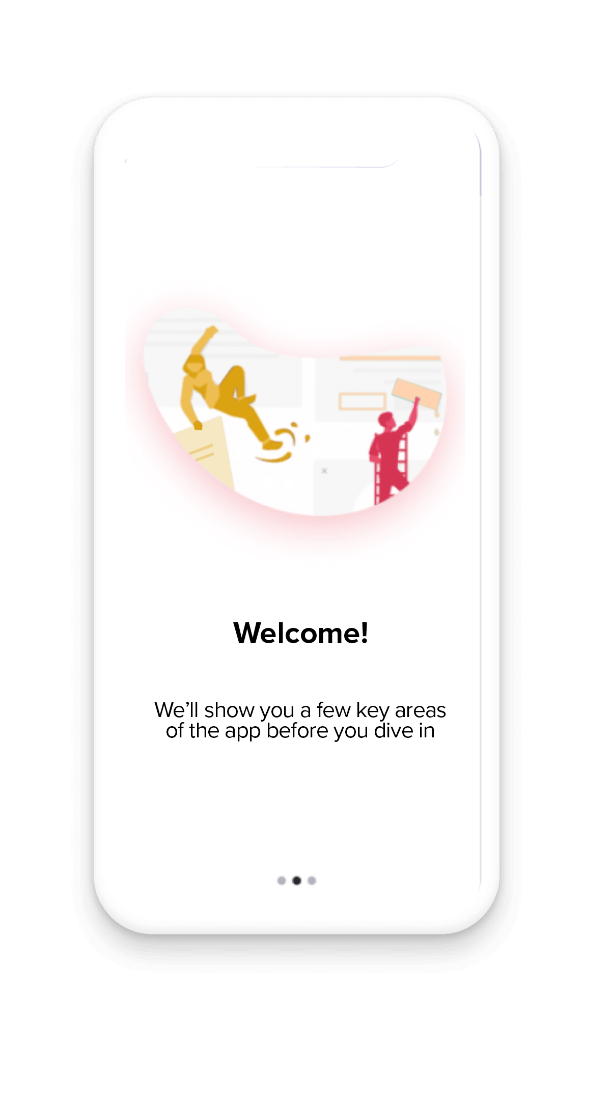
Onboarding carousel
A carousel (series of fullscreen messages) is a great way to highlight your app’s main features when users access your app for the first time. Use carousels to give users a high-level overview of your app’s benefits to help them understand the value and main features right off the bat.
Single page onboarding
Sometimes apps are intuitive enough where all new users need is a single-page introduction and welcome message. It’s also useful to start onboarding with a full-screen guide that explains the app’s main benefits, and let users choose their own adventure for the rest of their onboarding experience (e.g. through user-initiated onboarding or contextual help).
Best practices:
- Use similar branding for each step of an onboarding guide sequence to ensure a smooth visual experience.
- To avoid overwhelming new users, keep your onboarding guides to five steps or less.
- For longer workflows that you highlight during onboarding, show the total number of steps so users can see exactly how far along they are and how many steps are left.
- Keep the text in your onboarding guides as short as possible—brevity is your friend.
5. Feedback
While in-app messages are often used to communicate information to users, they’re also extremely useful in collecting information from users, too. Since customers’ experience with your app is top of mind, you’re likely to elicit higher response rates and more valuable feedback when you deliver surveys and requests inside the application itself. Here are some ways you might choose to collect customer feedback in-app:
投票調査とアンケート
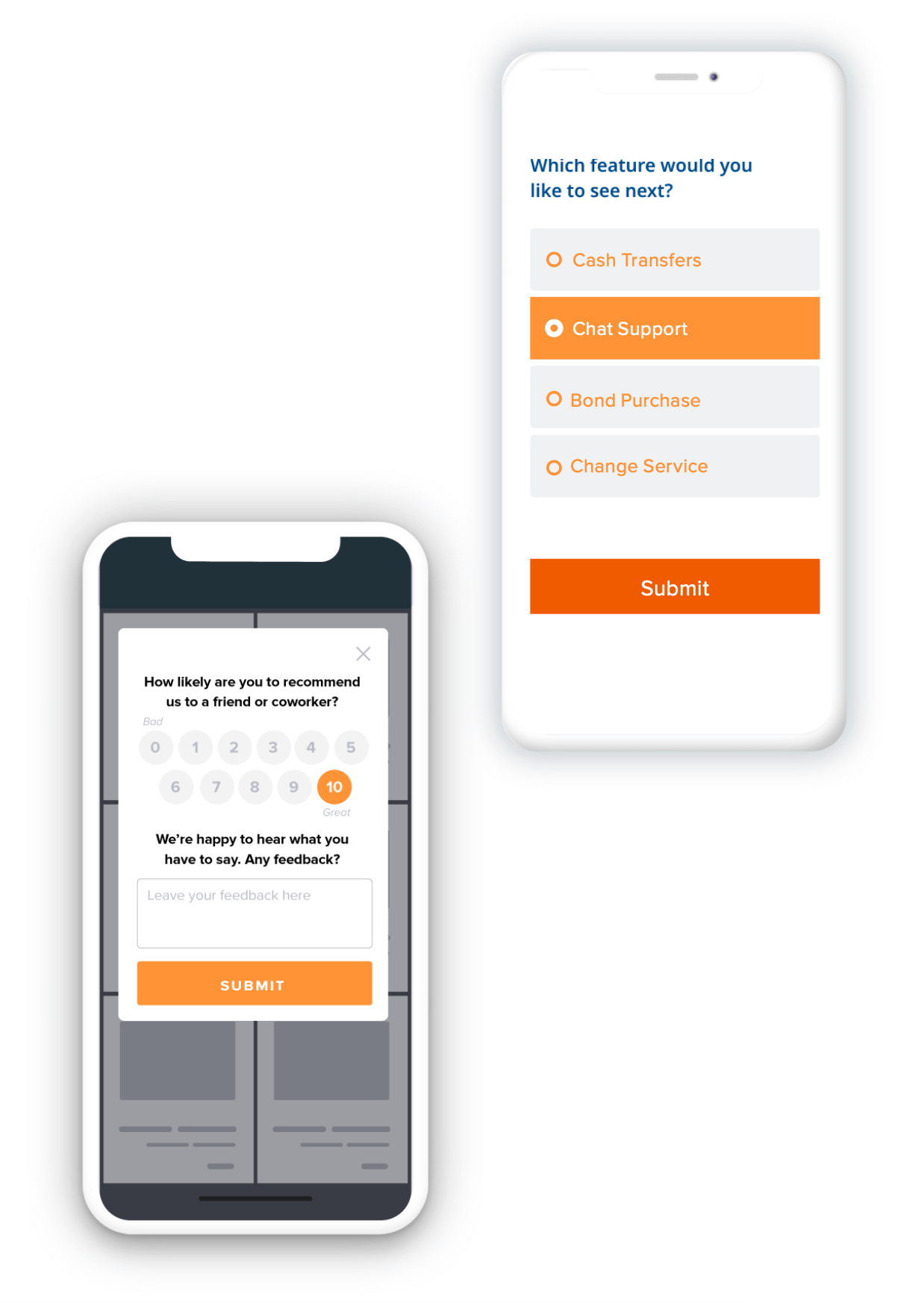
Polls and surveys are extremely useful (and versatile) for understanding customers’ sentiment and getting their feedback about specific app areas or experiences. For example, you could create a one-question survey for users to fill out after their support case is closed, or use a poll to ask users if they think a new feature will be useful to them.
Net Promoter Score
Net Promoter Score (NPS) surveys are an industry standard for quantifying how customers feel about products and services. They can be administered in a variety of ways, but are particularly effective when served in-app. This way, you can reach the specific subsets of users and target surveys at the right moments in the user journey.
App store rating request
Once you’ve collected feedback from users, you can use this data to serve additional guides, like a request for users to rate your app in the app store. Make it easy for users to rate your app by letting them do so directly in the app itself. The most important thing to remember is to only make these requests from users who are happy with your app—which is where NPS and feedback data comes into play.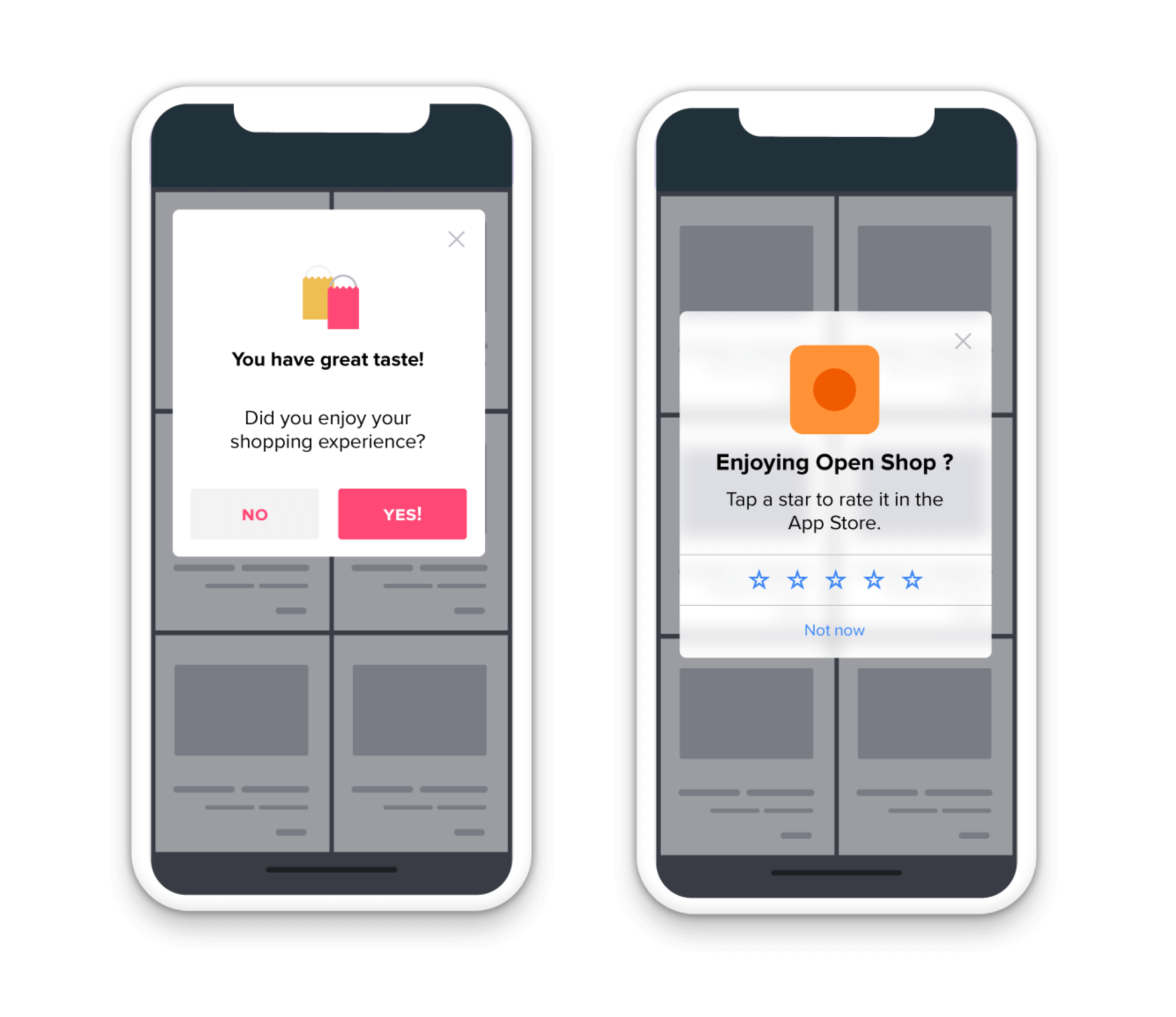
Best practices:
- It’s best not to place a poll right after users open the app for a specific purpose. Instead, trigger a poll at the end of a workflow when users are more likely to respond. Use a new feature or a special occasion as an opportunity to celebrate and ask for feedback.
- Since polls can be distracting, make your segmentation as specific as possible and only include users for which the poll will be relevant. It’s also useful to create segments based on whether users saw or responded to previous polls.
- Make sure you’re targeting NPS surveys so they are timely and relevant to your users—for example, someone who has only used your app for one week might not be the best recipient.
6. Promotions and offers
This is where it’s useful to think of in-app messages as little moments of delight in the user experience. Work with your marketing team to determine if there are any current promotions or campaigns that could benefit from in-app communications, and add these into your overall guide strategy. Here are two main types of promotional guides you could leverage:
Limited time offer
If your company has a limited offer, for example a contest or donation program, in-app guides are a great way to raise awareness for these initiatives. You can also use in-app guides to promote any joint marketing campaigns you’re running with another company, or offers on other products that your company sells.
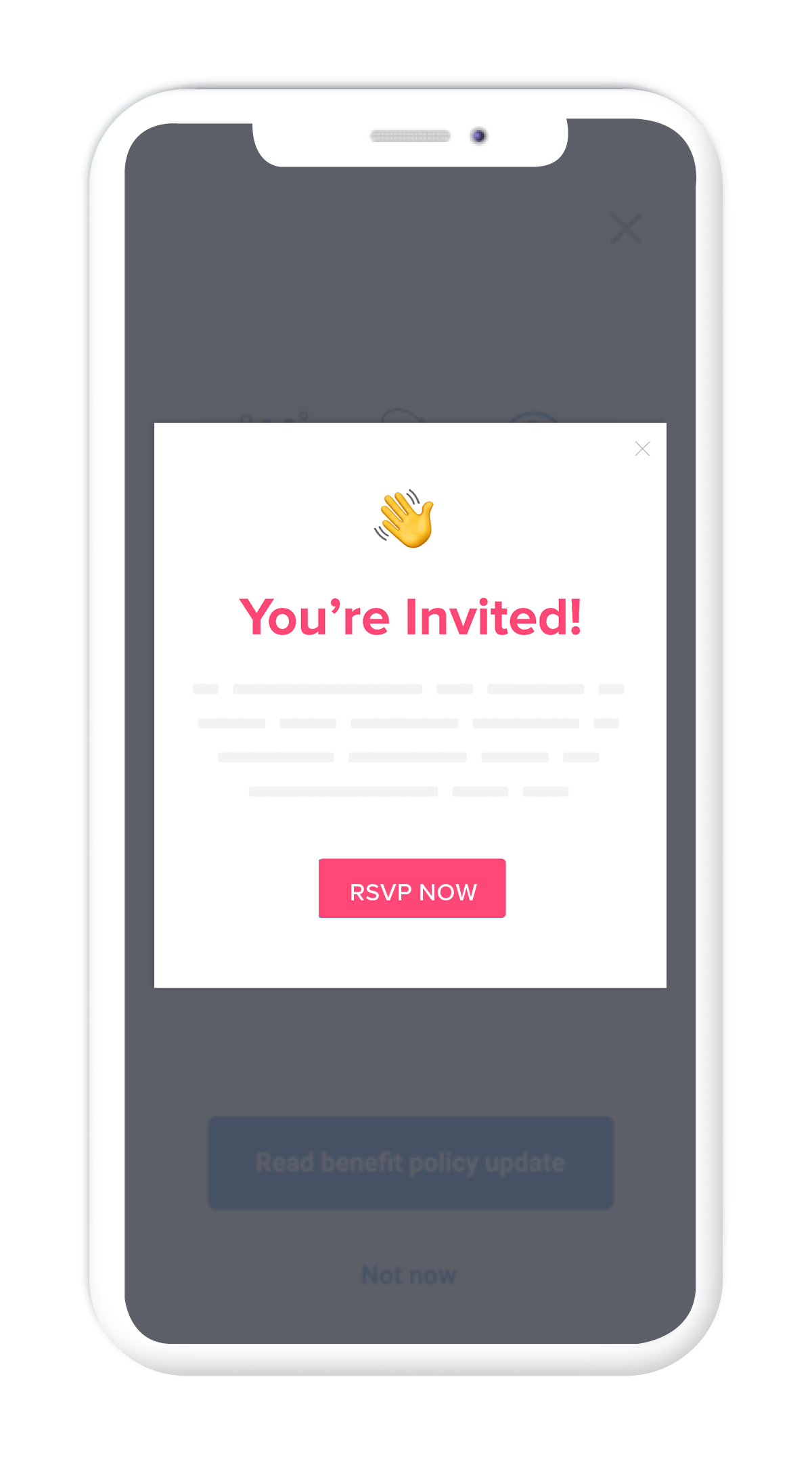
イベント
Whether you have a big virtual conference coming up or are hosting user group meetups in various cities, you can target guides to ideal attendees while they are using your app. Just be sure to provide enough information so users know what the event is and why it’s relevant to them.
Best practices:
- Think about how you can tie in-app messages to seasonal events that are relevant to your customers, for example by creating a “happy holidays” guide or “back to school” themed guide.
- Be cognizant of the timing of in-app guides that promote events or limited offers—the last thing you want is a customer to click through to something that no longer exists or happened in the past.
- Serve promotional in-app guides at the end of users’ workflows in your app, so you don’t distract from or disrupt their intended actions.
7. Measurement: Test, iterate, repeat
Building in-app guides that inform and delight users is only half the challenge of creating a better mobile experience. It’s also important to measure the performance of these guides, so you can adjust them over time and ensure they are making the greatest impact.
For example, use guide analytics to understand the length and type of in-app guides that work best for your particular app and user base (and segments of your user base). Think of your initial guides as tests, and then continue iterating them as you gather more and more data.
Here are some ways to approach measuring the effectiveness of your mobile in-app guides:
- Guide views: Determine how many people viewed the guide compared to how many users you targeted with the guide. This will help you understand whether a particular guide achieved the reach you anticipated.
- Guide step completion and time in guide: Examine if (and how many) users are making it through all of your guide steps, and how much time they’re spending viewing your in-app guides. These are two good indicators of guide engagement, and whether users are seeing value in the content you’re providing.
- Impact on product usage: Understanding guide engagement is valuable, but it’s even more valuable to know how interacting with guides affects users’ behavior in the app—for example, are they using the features you highlighted in your onboarding guides?
Keep reading
You must enable functional cookies to view this content.


