Welcome back to the Orient express. Our project is ‘steaming’ ahead, and frankly, is a bit ahead of my blogging. New users of Pendo should start to see parts of the updated experience shortly. Before diving into an update, let’s take a second for a shameless plug…
Take the Onboarding Survey
As I mentioned in the last post, we are looking for your input. We are looking to explore the state of onboarding across the industry. We want to learn how you onboard users, who owns the process, and how you measure outcomes. Please take a moment to fill out our short multiple-choice survey. We really appreciate the input.
An Onboarding Home Base
After we completed the storyboarding exercise, the team realized that we would need two levels of content within the onboarding experience: a high-level overview of key features, coupled with deeper-dive learning. Added together this ends up being a lot of content – more content than we expect that a user would consume in a single setting.
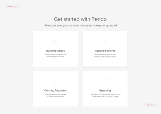
So we set out to design a landing experience we call the “home base.” Knowing that users would likely want to drop in and out of the onboarding content, we wanted to make it easy for users to come back and pick up where they left off. This led to the design of a unique landing experience:
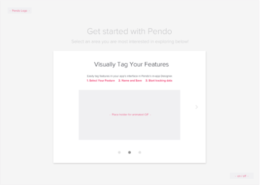
This broad design would completely take over the screen when a new user comes into Pendo for the first time, and when it is re-invoked. Each tile in the landing page brings up a short “tour-guide” style walkthrough that summarizes the key functions of each area with simple animations.
Each of the sub-guides would make up the first part of the onboarding experience. At any point in any of these walkthroughs, the user would be able to drill into the deeper level of content, go back to the main onboarding menu, or leave the experience altogether.
The design uses the full screen to layout the options in a way that is visually simple, yet provides easy access for users to come and go between the onboarding experience and the actual product.
Implementing the first part of the experience
It’s probably worth noting or reminding at this point, that this project is an experiment for us. We know that we want to improve the user onboarding experience in our product, but we won’t know that we’re successful until the experience is deployed, and we can see engagement levels as well as the downstream outcomes around features used, and support tickets. The work that I’m documenting here is the first part of what will likely be several iterations.
While 100% of what we are developing is currently possible in our production code, as we discover which aspects are more successful than others, we will productize specific features to allow our customers to easily achieve similar experiences without customization. If you are eager to accomplish a similar experience today, our services team is available to help.
The wireframes for the high-level experience are a departure from the typical way we (and our users) present guides and walkthroughs in the product. The question facing our small working team as we began to implement was: how much would we have to change the UI of our product to make it work?
Surprisingly the answer was “not very much at all.” Users of Pendo will know that we provide an option to customize the HTML/CSS, and even apply custom JavaScript to guides. Using our existing customization features, our front-end developers and Services team were able to implement the onboarding experience that we wanted without making any feature changes.
Now, we’re currently refining and user testing the experience with a plan to roll out the first part soon. In the next installment of the series, we’ll talk through the initial deployment as well as the approach the team is currently working through for the second part of the onboarding experience. Happy travels, and don’t forget the survey.
Follow the rest of Pendo’s onboarding journey:
All Aboard the ‘Orient Express’ – Part 1


