Using paths to understand user behavior
The UX designer role has evolved quite a bit. Traditionally designers relied heavily on qualitative feedback, working with user researchers or conducting usability testing themselves, but today we have access to powerful tools that supply rich user analytics. How does one balance quantitative with qualitative feedback to make data-driven design decisions?
At Pendo, our product design team is small. There are four of us and we sit within the Product team, along with Product Management and Data Science. Designers are responsible for more than designing workflows and features, but also writing task plans and conducting usability testing sessions with our customers. In addition, we also gather qualitative feedback through our customer success team, reviewing responses to our in-app messages and NPS surveys.
While gathering qualitative feedback is imperative to what we do, we don’t always have time to put every UX improvement or feature in front of our customers for feedback. That’s where quantitative analytics come in. We’re able to monitor user behavior and engagement throughout the customer journey and circle back with our customers to get qualitative insights. Complementing qualitative with quantitative is where the richest insights live.
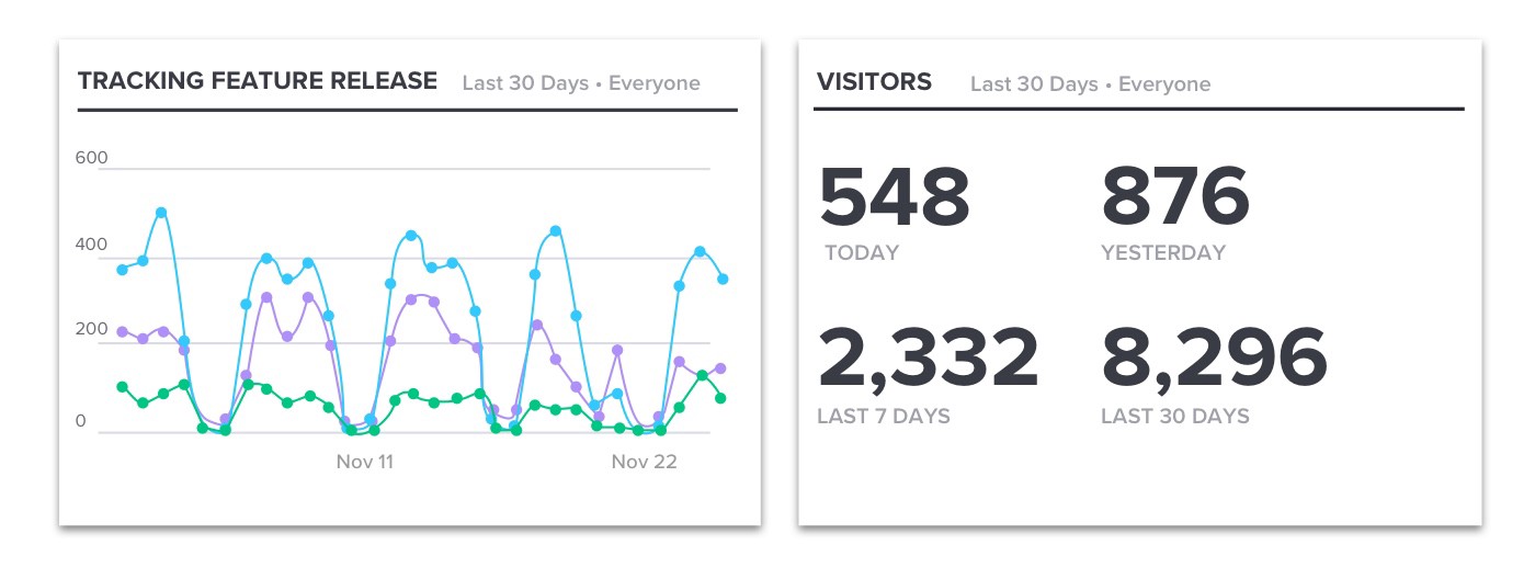
One of the ways the Pendo design team utilizes quantitative data is through Paths. We map out our core workflows or “paths” and continuously monitor the analytics to see user engagement and time it takes to complete a task. Understanding how your customers navigate through your application is critical for Product Teams, especially designers. Did users follow the intended path? How did they get here? Did they experience friction which caused them to abandon the task? What action did they take afterwards?
Paths are really insightful to monitor when you make workflow revisions or introduce new features, pre-and post-release. For example, you are able to see the most common paths users take, pages they view and elements they click. Did the recent updates speed up time to get to the next step or slow users down? Did they interact with that new element on the page? Also being able to compare behavior between different segments — like your primary and secondary personas — is really powerful in discovering if engagement varies based on user role.
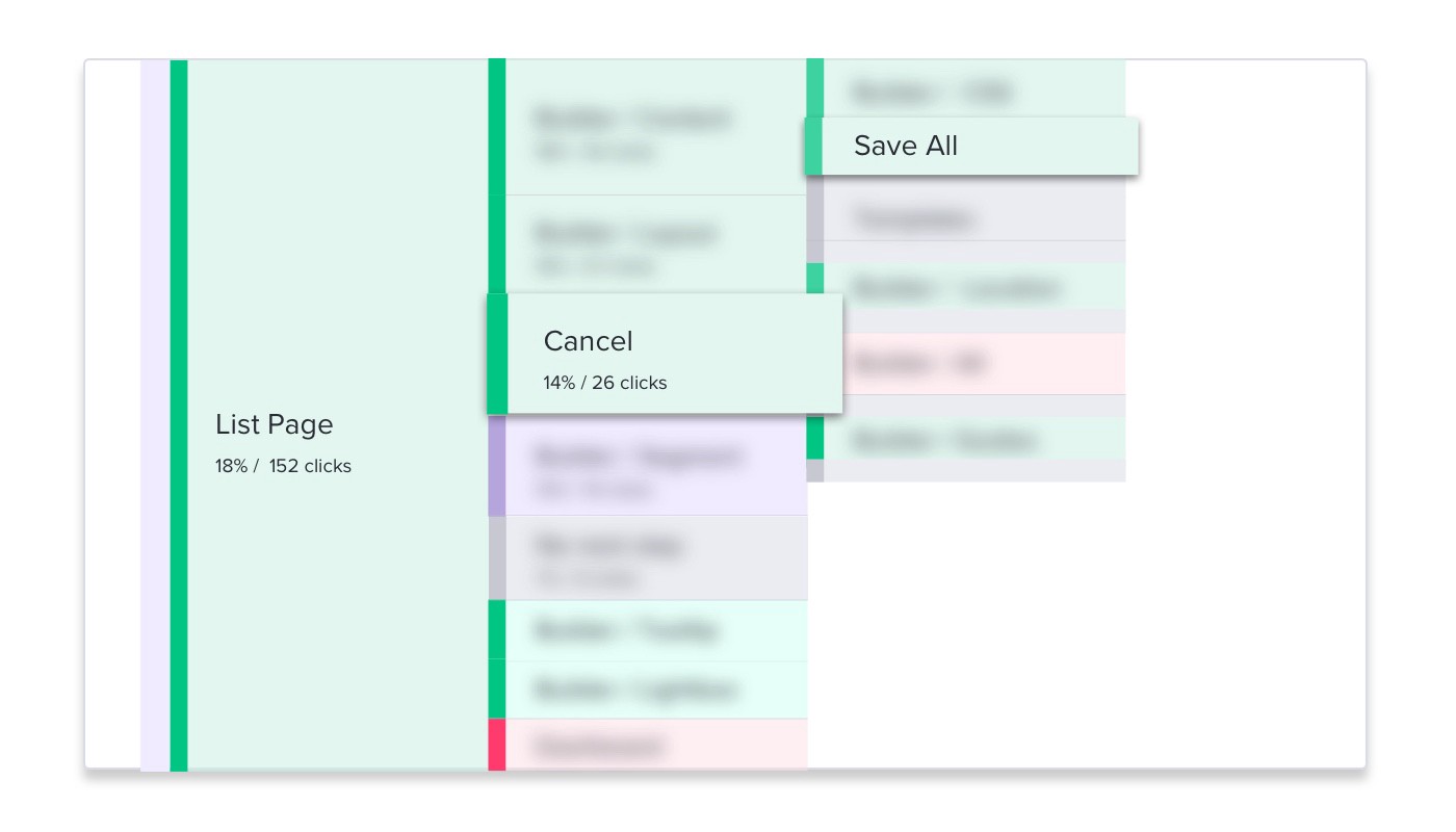
Recently we were monitoring one of our core workflows and noticed that more users were cancelling out of the workflow instead of saving. We were a bit surprised, so we started to dig into the data and made a list of questions. Which visitors were doing this? Why would someone do this? When we start asking why, that’s a good indicator it’s time to circle back and talk to customers.
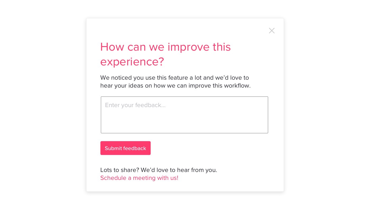
We then created an in-app guide targeted to those users who were cancelling out of the workflow more often. We scheduled 1:1 interviews to discuss their current workflow to see where they were experiencing friction. We discovered some consistent themes and identified friction points in the existing workflow. We also realized some users were still exploring and weren’t ready to commit by clicking save.
If we didn’t circle back to talk to our customers, we would not have understood the why behind the usage analytics. Qualitative plus quantitative data, helps us make the most informed design decisions.