You’ve spent months working on that new feature, collecting user feedback, testing different solutions, and working through requirements with your developers. Finally, all that hard work is ready for general availability. Releasing a new feature is always an exciting time, but launches never seem to go as smoothly as any of us would like. It’s often a time of uncertainty, where it’s not always clear if we’re on the verge of an epic collapse or an awesome breakthrough. It’s important to keep a close eye on your product analytics and be prepared for any question your executive team might throw at you. Here are the top questions you’ll ace with Pendo.
What should my launch target be?
When you’re building out your launch plan, it can be tough to know what an appropriate adoption target should be. But when you use Pendo’s Goals, we auto-suggest a ‘goal target’ based on available historical data. You can also use Data Explorer to look at similar features, which can provide a relative performance baseline.
Are we pacing on track to hit our goal?
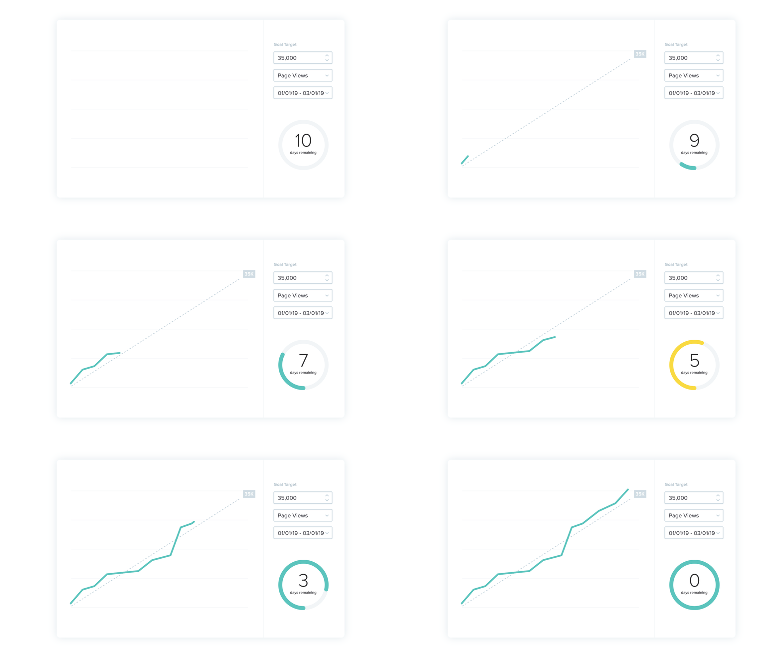
Once you’ve established your baseline, just set a goal date and Pendo will start tracking a cumulative activity line. This makes it easy to see pacing data and provide an ‘at a glance’ update for key stakeholders.
How are different personas adopting my feature?
Sometimes new features aren’t picked up equally across your user base. Maybe you’ve solved a problem for one set of users, but for others, you haven’t hit the mark yet. In Data Explorer, you can easily compare how different segments are adopting your feature, and see what traits the feature’s biggest fans share in common.
What tactics are driving adoption?
Creating segments in Data Explorer for “Guide Seen” vs “Guide not Seen” is a reliable way to anticipate feature adoption. You can quickly visualize the impact different in-app messages have on usage. What’s driving more activity: your announcements, walkthroughs, or tooltips? This view is also useful for A/B testing different message variants or guide treatments.
Are my users stuck in their ways?
When a new feature is designed to improve on or replace an existing feature, it’s important to watch usage for the new workflow and old workflow in concert. Create a segment that compares usage of the two, and watch if usage of the old feature decreases as new feature usage increases. If you don’t see an inverse relationship, it could indicate that users still prefer the old method.
How does each department’s activity impact adoption?
Beyond keeping stakeholders informed, a time bound Goal can be a centerpiece of your regular check-ins with the broader launch team. Hopefully, you’re meeting regularly with members from product, customer success, marketing, sales, and other customer-facing teams. Put your adoption pacing chart front and center, and help people visualize how their work helps move the needle.
How does this activity compare to MoM or YoY historicals?
Every business has some element of seasonality, so if you see an unexpected spike or drop, it’s important to view these in context. Data Explorer makes it easy to compare the current period to the previous period (e.g., last 30 days vs 30 days prior), or to the same period last year.
Are we sustaining enthusiasm?
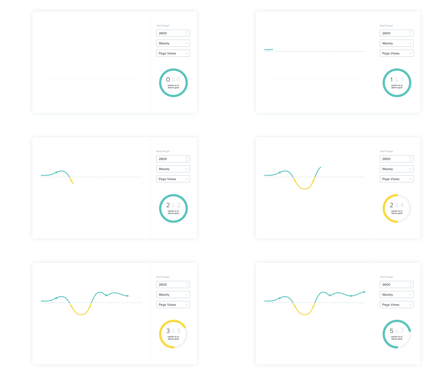
Once you’ve hit your initial adoption target, the ongoing work of maintaining feature usage begins. Again, Pendo makes this easy with another Goal type, ongoing goal. A time bound goal, which says “I want X usage by Y date” is great for driving that early usage spike, but an ongoing goal holds you accountable to “I want to keep usage above Z for the foreseeable future.” To keep building momentum, choose an ongoing goal that’s higher than your average baseline (and don’t worry, Pendo will automatically suggest a target that you can adjust as needed).
Pendo Goals and Data Explorer give you continuous, data-driven insights that make your team more accountable, collaborative, and, ultimately, effective. Learn more about using and configuring Goals and Data Explorer.


