
A question that we regularly ask at Pendo is: “How is feature X performing”? This open-ended question has many specific variants: “What is the adoption rate of feature X”? “What % of our customers are using it”? “How frequently is it used”?
We regularly use trends, goals, and retention analytics (soon, by feature!) in Pendo to answer parts of these questions. But we couldn’t get a complete answer, and wanted to build capabilities in Pendo to solve this issue. Enter feature adoption analytics.
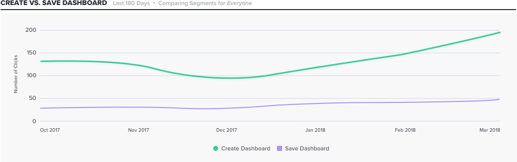
Our Trends widget allows us to compare the usage of individual features on a weekly or monthly basis. In the chart above, for example, the feature “Create Dashboard” has greater usage than the feature “Save Dashboard”in terms of the number of clicks, and we can see that the usage of both dipped down around the holidays (late December 2017).
While these data points are certainly helpful, we required a framework for measuring the utilization of all of our features at any given time. We wanted a metric that would tell us the proportion of time that a feature was used actively in our product.
The Pareto principle, or 80/20 rule, is commonly applied to the usage of software products, and so we investigated if it also made sense for our ecosystem of product features.
In particular, we wanted to know:
1. Which features account for 80% of our average daily usage volume? Is it roughly 20%, or more, or less?
2. What are our most frequently utilized features?
3. What are our rarely or never utilized features?
To answer these questions, we first collected usage data for all tagged features in the product for a given period (e.g., the last 3 months). We calculated the percentage of click volume attributed to a feature for a given day, and then used the average of those values, per feature, to build a metric of feature adoption. We’ve provided an illustration of the metric here.
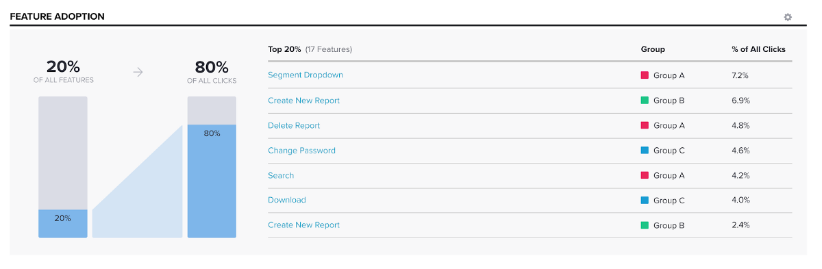
In the example shown above in our new feature adoption analytics visualization, of all the features tagged in the product, 20% of them (17 out of 85 total features) generate 80% of all the average daily click volume. The feature “Segment Dropdown” is the most used feature, followed by “Create New Report”. So we see that most of the users are adjusting or exploring different segments of users for whom they want to build an analytics report for.
Inspired by what we found in our own product, in collaboration with our marketing team, we explored what the distribution of feature utilization looked like across multiple subscriptions; we report on our findings here.
Now that we have benchmarked our current feature utilization and identified those features that generate 80% of the average daily click volume, we regularly ask ourselves the following:
1. Does our list of most-used features match our expectations?
2. Is our feature utilization proportional to our investment in feature development and maintenance?
3. Have we tagged the most relevant features in our product?
4. Housekeeping: are our tags up to date? Is it time for a feature audit?
5. What can we do to drive up the utilization of other features in the product?
Additionally, we now have an analytical framework for measuring the impact of our efforts on feature development and on future feature enhancements. For example, when we deploy guides to user segments that are below the desired threshold usage or conduct UI experiments to promote the visibility of the feature, we can now assess how well these strategies are working to increase the utilization of features.
We hope Pendo users will find value in this new tool as well!