Editor’s note: This article originally appeared on the ProductLed blog.
Your new user didn’t sign up to check out your product.
They came to see what your product could enable them to do.
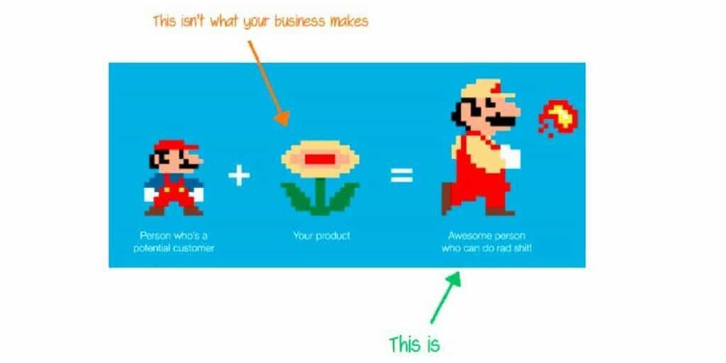
Samuel Hullick, the founder of Useronboard, sums it up perfectly in this image.
New users don’t look at your product (the flower) and say to themselves, “Wow, THAT is a nice flower. I want to buy one.”
No, they say, “Wow, I can spew fire from my mouth and grow three times bigger with that product. I WANT IT.”
If there’s one thing I’d like for you to take away from this article, it would be this …
“You can have the best product in the market but if you DON’T help people experience a key outcome, everyone will think your product sucks.”
To me, that sounds like a big ole wasted opportunity. And that’s why it’s essential to devote the necessary resources to improving your free trial conversion rate.
Let’s try to avoid it, shall we?
Step #1: 10x your user’s motivation
Let me start with a short story.
When I went to the University of Waterloo in Canada, I had to take one mandatory Statistics 101 course. I hated stats, but I knew I had to pass it if I wanted my degree.
So, when I was told I had to learn SPSS (IBM’s famously complex statistics tool), I reluctantly rose to the challenge and was able to blunder through the terrible user experience.
By the end of the course, I had a grudge against SPSS but was rather happy knowing that I’d never have to touch the tool again after the course (if I passed).
So, I studied my butt off and passed the course.
I thought it was luck but little did I know I had three things working for me.
- I was extremely motivated to pass this course.
- I was stubborn and blundered through the software’s terrible layout despite my low ability.
- I had constant triggers from my peers and class schedule to learn SPSS.
As a result, I put in the work to figure out SPSS.
This story isn’t unique to me.
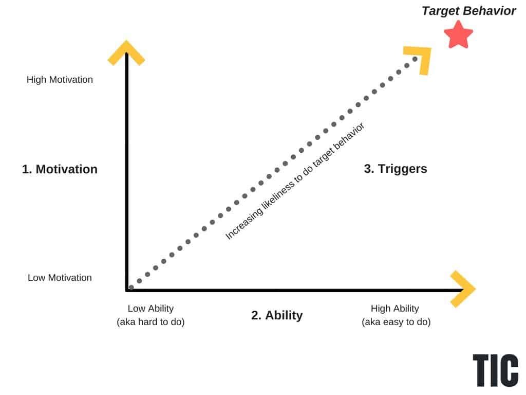
BJ Fogg from Stanford University did an incredible study to prove that if you have the right mix of motivation, ability, and triggers, you can change any behavior.
In this graph, we have four common scenarios that all SaaS product face, such as:
- Scenario #1: Your user has low motivation and low ability. Sorry, but you will never help them tackle a new behavior.
- Scenario #2: Your user has high motivation and low ability. You can afford to have a terrible user experience like IBM SPSS and still get people to change. Not ideal, but not the worst outcome either.
- Scenario #3: Your user has low motivation and high ability. This means your user will be able to accomplish the target behavior easily but could flee at any sign of friction or even when they’re hungry. Who knows!
- Scenario #4: This is the outcome I want you to optimize for. Your users have high motivation and high ability. This means that you’ll be able to help the greatest amount of people.
I’m curious. What scenario resembles your business?
If you’re not in Scenario #4, you’ve got an ugly leak in your business that needs a little more than some duck tape.
How do you increase the motivation of each user?
Be relevant.
Seriously. There is no shortcut around this one.
You need to speak your customer’s language and know what frustrates them to action.
If you would like to steal my exact process of doing customer research, you should check out my free Double Your Trials course. It includes all the templates and questions you need to complete a successful customer interview.
Beyond customer research, here are a few simple ways you can immediately improve your user’s motivation:
- Restating your product’s value proposition on your free trial signup page
- Adding personalization to your welcome email
- Adding a sense of humor throughout your onboarding
- Using checklists in your onboarding mail
- Celebrating quick wins in your product (i.e. Mailchimp’s infamous high-five when you send out a campaign)
- Showcasing the stories of people experiencing a meaningful key outcome in your product
I could go on but I hate to break it to you.
While we can try to motivate users to complete actions, it’s often easier and more cost-effective to optimize your free trial experience.
Any product that significantly reduces the steps to complete a task will enjoy high adoption rates (i.e. Amazon’s One-Click button).
Step #2: Optimize to convert free trial users
Imagine for a second you’re in Canada and it’s winter. Brr!
There is a foot of snow on your driveway and you have to clear the driveway to get your car out.
At your disposal, you have a 10 kg bag of salt and a shovel.
What do you choose?
If you’re like most Canadians, you’ll go for the shovel because it’ll be much quicker.
Using only salt might feel like you’re solving the problem, but you’ll most likely run out of salt before your driveway is cleared of snow. Not to mention, it’ll be an expensive way to maintain your driveway throughout the winter.
Where am I going with this?
When it comes to the SaaS space, you’d be shocked by how many companies try to use salt vs. a shovel when it comes to helping new users achieve a key outcome in the product.
Let’s say you’re the CEO of a SaaS business that wants to convert more users to customers.
Tell me if this sounds familiar.
The marketing team promises MORE to each prospect to boost conversions. (SALT)
The sales team improves its follow-up times. (SALT)
The product team focuses on making more features. (SALT)
Each of these “solutions” might help a bit, but it misses the mark. What’s missing?
Nobody is putting themselves in the user’s shoes.
After signing up for a free trial, the user can’t access the product before activating their free trial account in their email provider.
Then the user has to re-login and then is left to “figure out” the product on their own.
Your user feels like they are neck-deep in snow now. They don’t know where to go, who can help, or even what to do. The only thing they know is that they want to go back to a cozy, warm home.
Now tell me …
Are you going to use salt to help them?
Or are you going to be their hero and shovel them a path to show them where to go?
If you chose salt, you can say goodbye to a cool 40-60% of users who sign up for your free trial. These users will use your product once and never come back, according to Intercom.
How do you optimize your free trial for conversions?
To get some quick wins under your belt, I recommend using a simple Gut Analysis Checklist before and after the free trial signup.
The best part is anyone can go through this checklist and wind up with some brilliant ideas to improve your free trial to paid conversion rate.
The best way to use the Gut Analysis Checklist is to ask yourself each question while going through the experience of signing up for your product.
Before-signup checklist:
- Do all touchpoints have a consistent narrative thread from one to the other?
- Does each touchpoint help the user accomplish a functional, emotional, or social job they actually want to do?
- Is each form field you ask for on your free trial signup page necessary?
- Does every touchpoint promise an improvement to the user’s life?
- Are points of anxiety and struggle are directly addressed wherever they arise?
- Is the product’s personality engaging and consistent across the board?
- Is the product’s credibility established with social proof, testimonials, and real-world outcomes?
- Are all unnecessary points of friction and distraction removed from critical workflows?
After-signup checklist:
- Does the first-run experience in the product lead to a specific, relevant, meaningful quick win?
- Is the workflow for the first-run experience as streamlined as humanly possible?
- Is the users’ time spent floating in “limbo” states managed & limited?
- Are tooltip tours used to help drive the user to a quick win in the product?
- Are social and directional cues provided to indicate highly-valued behaviors?
- What key tasks are reciprocated with a success state such as Mailchimp’s high-five?
- Are lifecycle emails positioned to help users achieve a meaningful outcome in the product?
If you go through each of these questions, I have no doubt you’ll at least find one or two opportunities for you to improve your free trial to paid conversion rate.
While we can try to improve our free trial conversion rate, it won’t mean much if we can’t build a habit-forming product.
Step #3: How do you build habit-forming products?
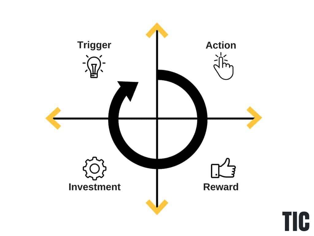
Nir Eyal spent years figuring out how to answer this question. In his book, “Hooked,” Nir lays out a simple framework called the “hooked cycle” which consists of four parts: trigger, action, variable reward, and investment.
Each part works together to help people build habits in our day-to-day lives.
Thanks to Abi Noda, here’s a great breakdown of each of the four parts of the Hooked Cycle:
Trigger: What are users feeling and doing the moment before they would use your product? What is the emotional need they are solving with your product? Facebook, for example, relieves us of the feeling of wanting to belong and be important to others. Email relieves us of uncertainty and staying connected. Understanding these questions is the basis for designing a good customer acquisition model and re-engagement strategies (eg. email notifications).
Action: For a product to be sticky, it has to be simple and easy to use so that there are no barriers to adoption and usage. While we can also try to motivate users to complete actions, it’s easier and usually more effective to reduce the effort it requires.
Variable Reward: Providing variable rewards after actions keep users excited and motivated to keep on using and returning to your product. The three types of rewards are (1) material (eg. saving money), (2) social (eg. feeling accepted or important), and (3) completion (eg. clearing out your inbox).
Investment: Humans place more value on things they’ve committed their own labor to. Thus sticky products should become more valuable over time based on what’s been put in the user (eg. amassing followers on Twitter).
In the Hooked Cycle graph below, you start with a trigger, follow with an action, a reward, and then an additional investment. In order to have a habit-forming product, you need to repeat this loop consistently to reinforce your product with a specific trigger.
When it comes to using triggers in your business, you should know that there are two main types: external and internal triggers.
External triggers are arguably the easiest ones to control on your end.
Here are just a few external triggers:
- Paid triggers (advertising)
- Earned triggers (public and media relations)
- Relationship triggers (word-of-mouth marketing)
Internal triggers are much trickier to pinpoint and bake into your product but a million times more powerful.
Internal triggers manifest automatically in your mind.
Think about it.
What is (5 X 7807) / 13,123 = ?
If you’re like most people in the developed world, you might have thought about checking your phone calculator.
That is, no doubt, an internal trigger that you’ve honed over years.
However, if I sent you an email telling you to use the calculator app on your phone, you’d quickly tune it out if it wasn’t immediately relevant to you.
When thinking about building a habit-forming product, I find it helps to pretend you’re starting a fire.
External triggers are your kindling and have a very short lifespan but are absolutely needed at the beginning.
Whereas, internal triggers are your thick logs, that will last for a long time.
Both triggers are extremely important to build a fire but you need to know when to use both.
When it comes to improving your free trial conversion rate, build external triggers for onboarding users. Design around internal triggers for satisfying and retaining users.
Tie everything together to improve free trial conversion
A free trial is a promise of value that you’re letting people try out for themselves.
Companies that can’t deliver on this promise hurt their brand and sales numbers.
However, if you can deliver on your promise, you can deliver an impressive first impression that leaves your user wanting to upgrade.
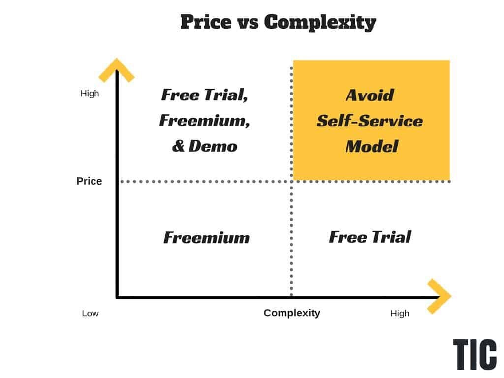
One thing I hope you’re not inferring from this article is that you need to be a self-service business. You can have a successful software business without being self-service.
For instance, if you have a very complex and expensive product, it can often be more beneficial not to employ a self-service model (see yellow zone below).
With that being said, if you don’t have a self-service model but think it might work for your SaaS business, you should read this article on how to identify whether you should have a free trial or freemium model or consider signing up for a free trial launch workshop. This will save you countless hours and resources figuring out how to launch a world-class free trial or freemium model.
Now, I’m curious.
What other ways have you tried to convert free trial users into customers?
![[object Object]](https://cdn.builder.io/api/v1/image/assets%2F6a96e08774184353b3aa88032e406411%2F39f3ccde352b460cbf348ccc952054cd?format=webp)
