Over the past few months, we’ve been working on our redesigned guide authoring experience. As a designer on a product team, I’m matched with a product manager on the project. A lot of our time these past few weeks have been spent working with our development team to get features incorporated, but we’re also prepping for how we will run the beta of our release.
Here are three quick things in Pendo I’m using to help us prep and track the beta, and to help facilitate our conversations with our beta group of customers.
1. Pre-tagging Pages and Features
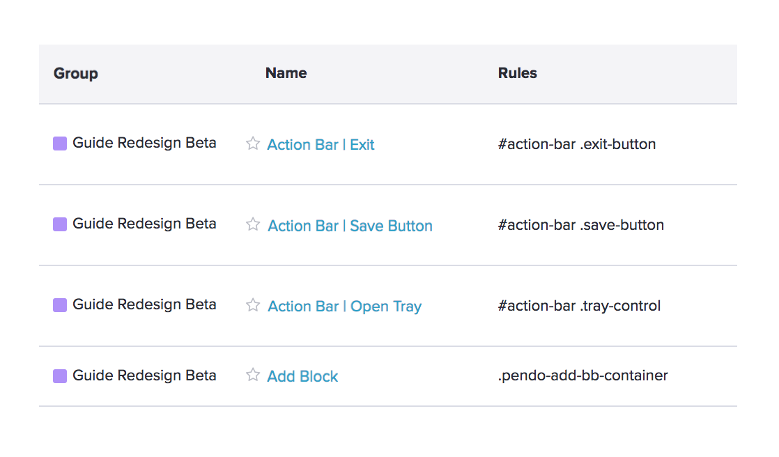
Tagging pages and features within Pendo allows us to immediately begin seeing usage on the beta as soon as we launch, which is extremely valuable. We’re able to see if users who opted-in have begun creating new guides and what they are exploring. We created a new ‘Group’ within Pendo to help categorize all the new elements to easily filter within the app and provide an easy way for users in our organization to keep track of the progress.
We plan on using feature clicks to help prioritize features post-beta, as well as building paths to see how users are navigating through the new experience.

2. Launch guides to intro the beta and begin collecting feedback
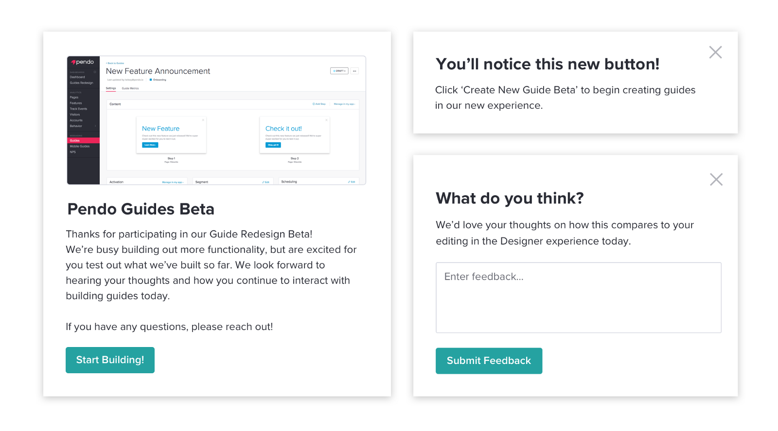
We’re excited for users to begin playing around with the beta, but also want to introduce the experience and set expectations for what new functionality has been built.
Throughout the beta, we’ll be collecting qualitative user feedback by scheduling sessions with our users. But just as valuable is the contextual feedback we can collect while users are actively using the product. I’ve already prepped a walkthrough and a few tooltips that we will launch in the app once we flip the switch!

3. Setting reports and a new dashboard
There is one main objective we are trying to accomplish with this beta. Our goal is for customers who have opted into the beta to use the new designer more frequently than the legacy designer. We’ve added an access point to our new experience next to the normal button users would click on.
We have a specific segment set up that includes all beta participants and I’ve set up a trend report to compare the usage of these two buttons. To keep this goal top of mind, I added the trend report to my Redesign dashboard to easily see the data coming in once we launch!
We’ll be using a combination of the quantitative analytics above and our user feedback to help prep for a full release soon!


