Editor’s note: In January 2022, we updated the calculations for two of the Product Engagement Score (PES) components to make the metric more stable and actionable. Learn more about the changes to PES here.
I’m a pet parent to an adorable dog and an ornery cat. But, I would never admit which one is my favorite. Like admitting to a favorite pet–or worse, a favorite kid–product leaders often say that there isn’t one product metric that’s better than the rest. Again, I won’t admit anything around the first part of this paragraph, however I do believe there is one metric that every product team should be measuring, and that’s the product engagement score (also known as PES). This is a single number that represents the combined impact of feature adoption, return user stickiness, and new user growth.
Pendo introduced the product engagement score to our platform at the end of January, and since then, we’ve received a ton of great feedback around how we can make this metric even better. One of the most common questions we’ve received is, “What does good look like?” (or, “Is my score good?”). This is an important question to ask, and a good reminder that benchmarks and comparison (even if it’s just internal comparison over time) can help us get the most out of our product data.
We are actively working to help you answer these questions in the product itself, but until we get there, I thought I’d share a behind-the-scenes look at how we interpret our own PES at Pendo.
A look into Pendo’s PES
At Pendo, we track our product engagement score on a rolling 90 days, and our score today is 48.
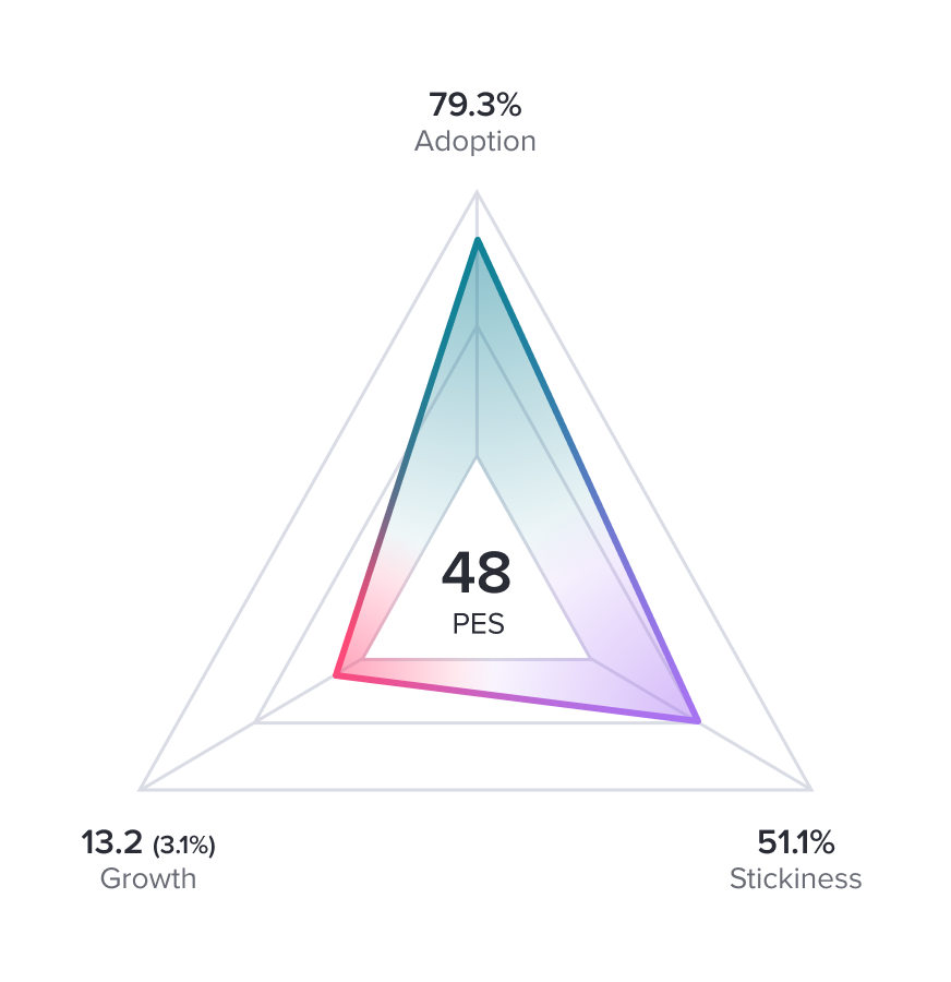
Is this a “good” product engagement score? We can easily see which metric is bringing down the average, but let me break the number and its components down even further. Here’s how I would interpret Pendo’s current PES:
Adoption: Digging into Core Events
Adoption measures the percentage of our accounts who are using any of our Core Events. When I just see a number like 79.3%, I think that’s wonderful–a vast majority of our accounts are using at least one of our Core Events. Then, I think about the individual Core Events. If I were to look at the adoption of each of those features, could I learn something? Could I find places to improve?
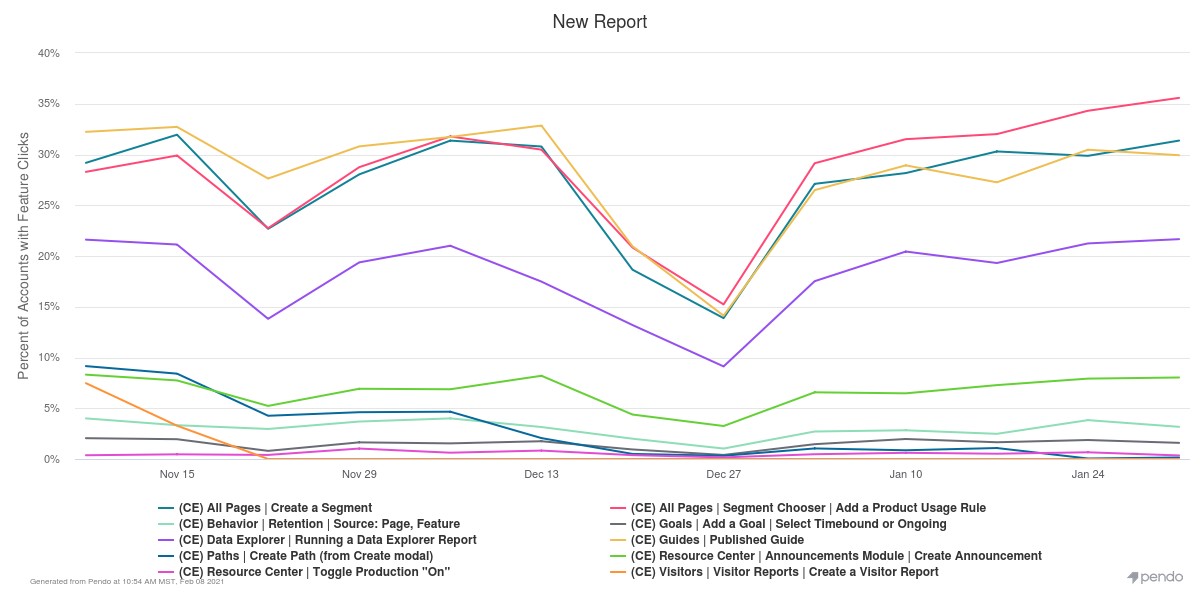
In Pendo, I can pull that information today using Data Explorer. What I find is that there are certain Core Events with much lower adoption rates than others. For example, less than 2% of accounts have created a Goal in the last 90 days. This is information I can act on, and my immediate thought is: How can I bump that number up to 10%? And how might that affect my overall PES?
Stickiness: Examining change over time
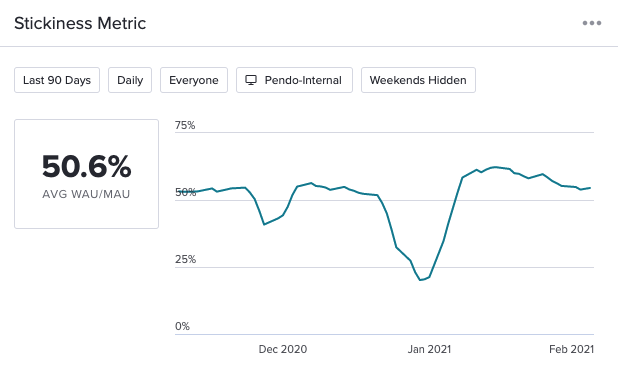
Stickiness measures the percentage of your user base that is returning to your product daily or weekly over monthly. With stickiness, I really want to understand how this is changing over time. Our stickiness value of 51.1% is pretty solid–this means that over half of my monthly users are returning weekly. But how does this compare to last week, or last month? And how can I start to make some improvements to my outreach strategy (or product as a whole) to convince users to log in more frequently?
One idea is to target a specific cohort of users and encourage them to try out a feature I know is tied to retention, like Data Explorer. I could launch an email drip campaign to bring people back into the product, introducing newly-released features they might find interesting. I could also run an in-app survey for my highly-retained users to understand what brings them into the product each day. Over time, I would then hopefully see an increase to my overall stickiness number.
Growth: Identifying the highs and lows
Growth looks at the percentage increase of your user base over a period of time. With growth, it’s all about getting more new visitors logging into the product. When I look at our growth value, 13.1 is low, and I would like to see that much closer to 100.
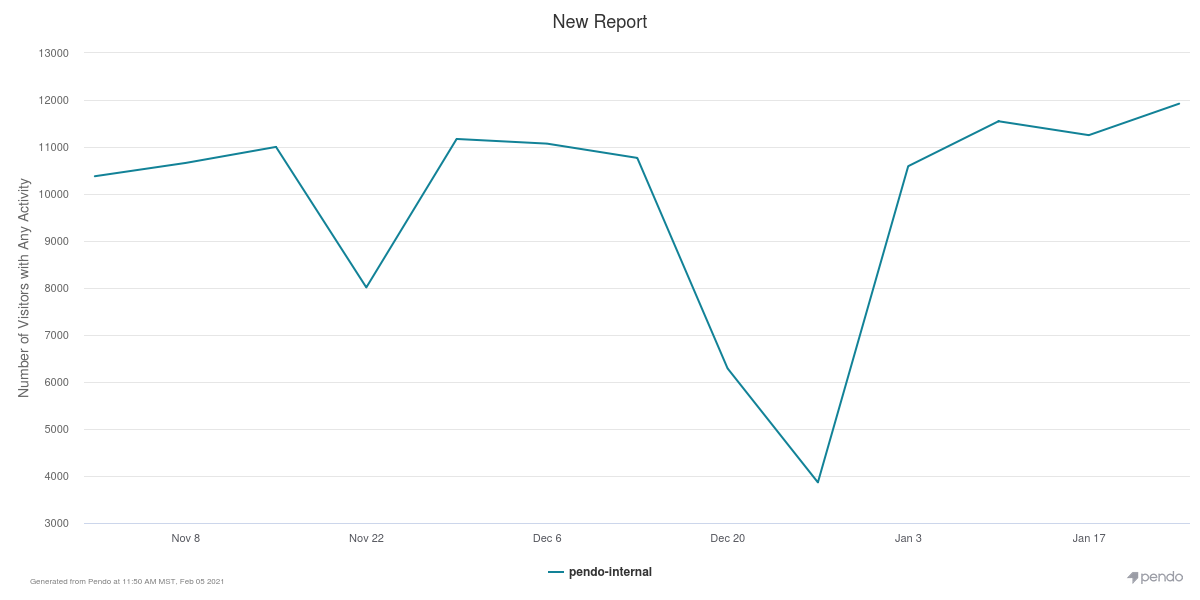
Right away, I need to see how growth is changing over time as well as which of my accounts are highest or lowest growers. If I have a large account that is stagnant in growth, perhaps I can reach out to the champion to strategize how we can improve growth over time. I could also ask each customer success manager to do the same with their accounts. While this information is not as easy to collect as I’d like it to be, we have plans to bring this account-level detail to the forefront with PES drilldown (more on this below).
Putting PES insights into action
So now, I return to the original question of this post. Is our PES of 48 good? My perspective is that it’s a good starting point. I can use this number as a baseline, and work to improve from there. Our biggest opportunity is increasing our overall growth number, but there’s so much room for improvement in adoption and stickiness, too. This year, my product team will be spending some dedicated time thinking about how we can make moves to improve adoption.
More importantly, in the next few months we’ll be introducing a new PES drilldown to provide you with the tools you need to do this analysis at a glance within PES instead of manually pulling Data Explorer reports or dashboard widgets. In the meantime, I look forward to hearing all of your stories about how you’ve been able to interpret and improve your own scores. Good luck!