Here on the product team at Pendo we take the company’s core value “Maniacal Focus on the Customer” to heart, and firmly believe that our best work comes when we involve our customers every step of the way. We also, like most product teams, have no shortage of things in the works, so we’re always ready to experiment with new ways to invite our users into the process in an efficient, low-impact manner.
Lately, we’ve been experimenting with InVision and Pendo to achieve asynchronous, one-to-many “user testing”. This allows users to provide focused, actionable feedback on a clickable prototype when and where it makes sense to them, while maximizing the volume of qualitative data we need to validate and iterate.Though this doesn’t represent the entirety of our user testing process, it has proved a unique and effective piece of the product design puzzle.
How it works
We achieve this solution by embedding an InVision prototype in a Pendo guide that our users can engage with directly in the product. It starts with an introduction to provide context, a (nearly) fullscreen prototype optimized for this use case, and a way to provide feedback afterwards, all accessible from a launching point that we strategically position in a relevant area of the product.
Setting up the guide
Building a “user test” guide starts with creating a three-step Pendo walkthrough guide with badge activation. By activating via a badge, it increases the efficacy of the guide in two ways. First, by providing a point at which users can engage with it at their convenience instead of showing a message automatically, which may catch users at the wrong time and/or get closed immediately. Second, we can place the badge in the context of the particular area of the product in question, which ensures that people discover our prototype guide when it is most relevant to what they’re doing. We generally use an InVision icon for the activation badge to indicate an area of the product we’re currently testing, and to give users a hint as to what they can expect when they click it.
![]()
In addition to contextual placement of the badge, using Pendo’s segmentation functionality we can also target the guide to a specific subset of our user base. For this type of experiment we generally deliver this guide only to people belonging to our core personas who have used our product at least 10 of the last 30 days.
The Introduction
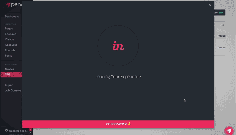
When users click the badge icon, they’re greeted with a lightbox containing an introduction message to provide context and outline what we would like them to do. This is an important part of the flow because it sets the tone for the experience ahead, and behaves as an “opt-in” step to ensure that the user is in control and interested in participating.
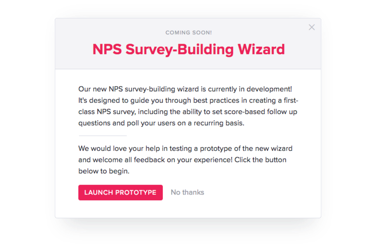
In the above example, we described what the test was about and invited our customers to participate by clicking the “Launch Prototype”, but if they weren’t interested, they could also click “No thanks” or the “X” at the top (it’s always important to provide a way out!).
The Prototype
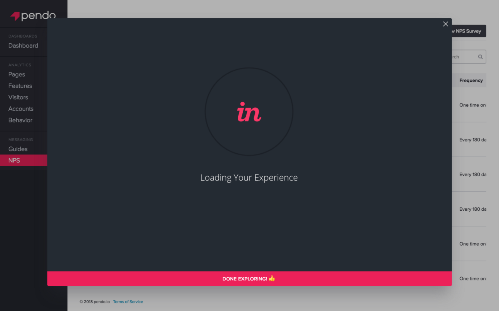
The meatiest portion of this experiment is of course a clickable InVision prototype of the particular feature or flow we’re testing. It’s important that the prototype be a well-defined “closed loop”, or completely navigable without the user getting stuck at any point, since they’ll need to move through it without any guidance. (Some cases require a more linear progression, in which we include a message at the end of the flow explaining that they’ve completed it so there’s no confusion.)
Once the prototype is ready, we create a public share link from InVision and embed it in an iframe, housed within the second step of the walkthrough guide and configured to encompass the majority of the screen. This is the real magic behind the whole experiment: delivering a fully interactive InVision prototype within a Pendo guide, directly in-app.
Even better, embedding the prototype is as simple as pasting the InVision share link within this HTML block:
<div class="_pendo-guide-invision-embed_">
<iframe src="{{ invision app link goes here }}" frameborder="0"
allowfullscreen="allowfullscreen"></iframe>
</div>
<button class="_pendo-guide-next_">Done exploring!</button>
We add in some concise CSS and JavaScript to optimize for making the guide almost full screen to give the best possible view of the prototype while preserving a hint of Pendo behind it to preserve context. The guide is also responsive to ensure its accessibility on any computer or tablet.
At all times on the prototype step, we show a “Done exploring!” button (it’s pink to make sure users see it.) This allows them to advance to the next step after completing the prototype.
You can learn more about how to build your own prototype guide in Pendo via our help center article and access all the necessary code on GitHub.
The Feedback
While delivering the prototype is the most extensive step of this experiment, sharing our vision with customers is only half the conversation. We still need their feedback to make decisions. Therefore, once a user has completed the prototype, they advance to the third and final step: feedback.
This consists of several elements: an open text field, a button to restart the prototype step, and a message explaining that they can always schedule a video call with us for more conversation, with a link to our Calendly account.
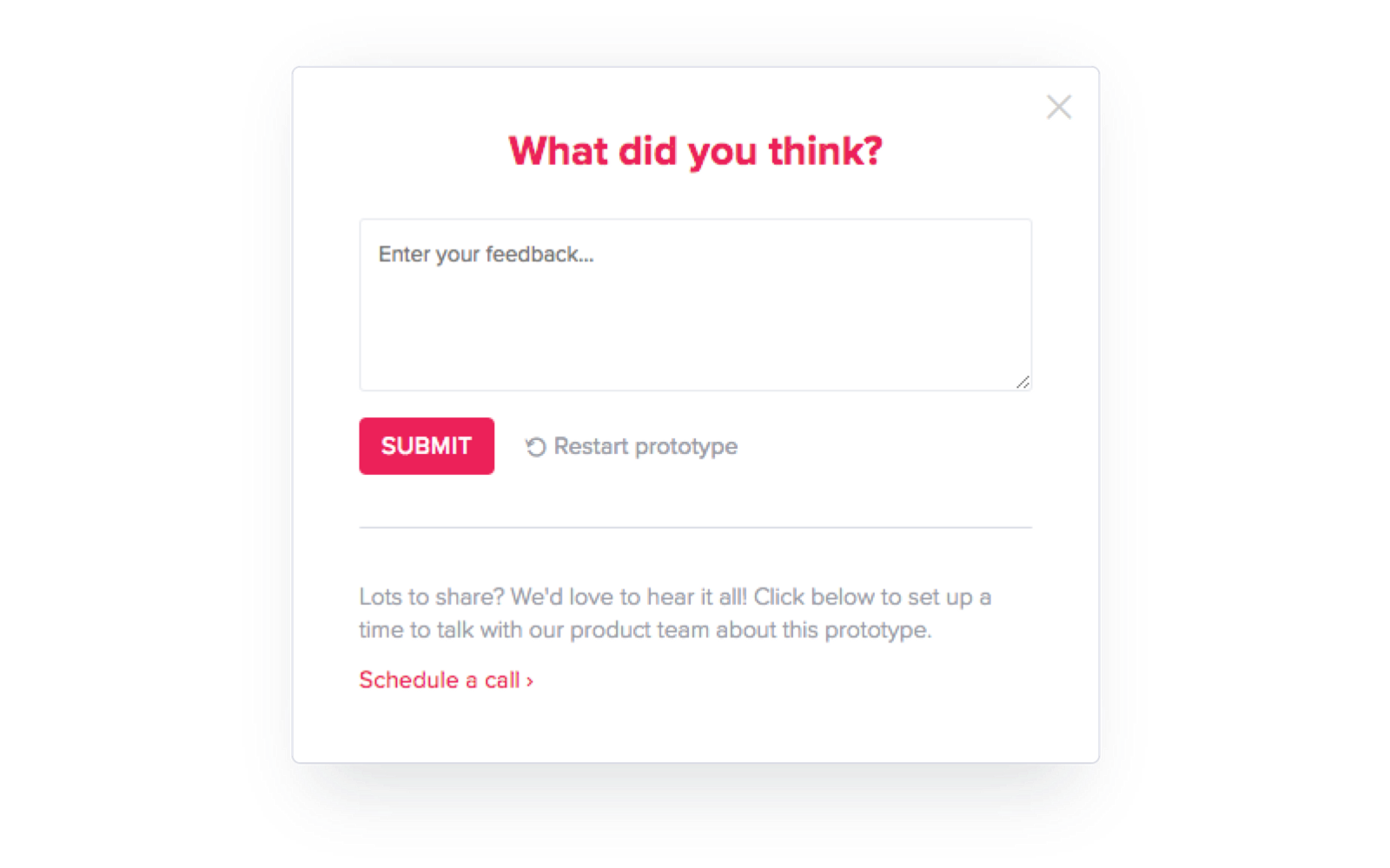
The open-text portion of this step has no character limit, meaning respondents can provide whatever thoughts they have, from “👍” to a bulleted discussion of usability wins and concerns (we’ve gotten both). This works well because the quick, unintimidating format allows users to contribute as much as they wish without necessarily imposing on their workflow.
結果
After a couple rounds of the “one-to many user testing experiment”, the results have been refreshingly positive:
- 259 views
- 49% response rate
- 9 follow-up user tests generated
A few of the responses we received:
Looks great! Looks a lot more user friendly (guided, readable, etc). Excited to actually use it as part of our subscription.
Not sure about the most recently view pages etc. Having favorites displayed would be more useful. 2 clicks to get to the full list (which is an explore view for me) is annoying. I like to get to the full list and then filter how I want for exploring/ad-hoc reporting. I worry about the flyout menu on small laptop resolutions.
I think this looks awesome! Can I be in the beta when it comes out?
Would like to see what the expanded Pages/Elements page looks like. I am concerned about having to navigate all pages, elements, visitors, accounts, segments, etc. via a fixed width left hand navigation element.
Recap
We on the product team here at Pendo are excited about this experiment because it represents an entirely new method of facilitating user research. While more casual and high-level than more traditional forms of testing, it has proved invaluable in both steering the direction of our works in progress as well as creating a roster of individuals who care about the work we’re doing with whom we can follow-up for more extensive discussions.
“…love how you shared your invision comps with us using Pendo, that is another great way to collect feedback outside of the more one-on-one methods we use.”
In this industry, we accept that we and everyone else have a lot going on. People may have thoughts and opinions on the products they use every day but don’t have the time to reach out or don’t know how, and we as product professionals will always want more contact with our customers but may struggle to make it happen regularly. The benefit of meeting users where they are (in your product) is something Pendo has touted since its inception. This experiment builds on that methodology and confirms in an exciting new way that it’s possible to gain real input from your users more efficiently on both sides, for faster iteration and better product experiences.
Feedback appreciated. Submissions welcome.