There’s no doubt about it: While we strive for our mobile apps to be intuitive and user-friendly, there are always opportunities to enhance the user experience for our mobile users. One of the most successful ways you can do this is with in-app onboarding—leveraging guides, tooltips, and help buttons in the app itself to help your users right when they need it.
PMs know that updating and launching new app versions (and then getting users to upgrade!) is a lot of effort—which is where the magic of Pendo comes in. With Pendo, you have full control over the in-app experience without ever needing an engineer or a new version of your app. You can react as circumstances change, launch new features successfully, and get new users to value quickly—all without touching a single line of code.
What is mobile app onboarding?
Mobile app onboarding is the process of helping users get started with your app in an automated way, so they begin engaging with high-value features right away. Typically, this is done through a welcome guide that walks users through set up and using the core functionality of the app.
Why is mobile app onboarding important?
A good mobile app onboarding process leads to higher software adoption, better user retention, and an overall enhanced product experience. In-app guidance and user analytics can be combined to take this to another level: contextual onboarding (more on that below).
Is mobile app onboarding necessary?
Not all mobile apps require extensive in-app onboarding programs, though all apps should include some form of “welcome” or user interface (UI) explanation to help users get familiar with the product. A good rule of thumb is to think about the primary goal you want your users to achieve within your app, and to start by focusing only on the areas of the product they need to leverage to achieve that outcome. In other words, rather than showing your users everything they could do with your mobile app (which could overwhelm them), focus instead on showing them the most relevant or important areas of your product that will help them realize value and start seeing returns quickly.
- For apps with basic or limited functionality, make it easy for users to start exploring your app’s interface. Create a delightful experience with a “welcome” lightbox and one- or two-step explanation of how to use the app, then let users get right into it. You can also use subtle tooltips in key areas of the app to help users passively learn about their functionality in an unobtrusive way.
- For more complex mobile apps, create step-by-step instructional walkthroughs to give new users a lay of the land and help them get familiar with how to perform key tasks. Also be sure to use tooltips and trigger-based in-app guides that show users tips within the context of the app or the action they’re trying to take so that the information sticks and they can learn as they move through a process.
For mobile apps in particular, it’s important to keep your onboarding as brief (but still as useful) as possible. With limited screen space and user attention spans, your aim should be to make the most of the real estate you do have and create an onboarding flow that’s informative, but concise. Using Pendo, you can also personalize your mobile onboarding flows based on user metadata—for example, based on role or app version—which further improves the onboarding experience (and likelihood of long-term adoption) by making your onboarding content even more relevant and contextual.
What is contextual onboarding, anyway?
Contextual onboarding is a way to help your new users—or show existing users—new features and workflows in your application. When onboarding is “contextual” it means you’re able to give users the right help at the right time. Instead of showing all of your users the same in-app guides, contextual onboarding allows you to target users based on where they are in their journey to ensure your messages are genuinely relevant and helpful. In Pendo, you can choose exactly who should see which guides, helping to keep the content engaging and relevant to each individual user.
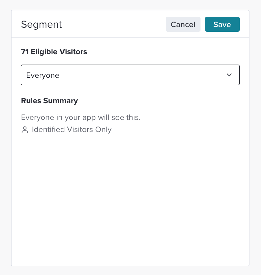
When you’ve invested so much in creating a great app, including contextual in-app onboarding as part of your user experience means you can be confident that everyone is supported and using your app in the intended way.
What are the core elements of mobile app onboarding?
No two in-app onboarding flows are the same—each should be tailored based on factors like your app’s specific functionality and goals, or your users’ levels of proficiency. But as a general rule of thumb, the best in-app mobile onboarding programs contain the following core elements and follow this basic flow.
1. Welcome
Your “welcome” experience forms your users’ first impressions of your app—and more broadly, your organization—so it’s important to get it right. Consider injecting the first guide your users will see with a little bit of joy in the form of a friendly message, emoji, or GIF (or any other little touches that are aligned with your brand identity).
2. Feature promotion
This is the step in your onboarding flow where you can highlight the core features or benefits of your app. It’s an opportunity to get your users excited to get started with your app, and to connect your product’s functionality to the value it will deliver—thus planting the seed for long-term adoption. It’s important to keep this portion of your onboarding as concise as possible. Again, you don’t want to overwhelm new users with information or leave them feeling unsure of where to start. It’s also a good idea to allow users to X-out of this section of your onboarding flow to allow users who are already familiar with your app to get started, and to give learners who prefer to explore for themselves the option to dive right in.
3. User set-up and personalization
Depending on your app’s purpose and audience, you can use part of your app’s onboarding flow to collect information from your users to further personalize their app experience. For example, you could give users the option to select their role or primary objective so they can learn the functions of the app that are most relevant to the jobs they’re trying to get done (e.g. an administrator that will be approving expense report submissions vs. a user that will be submitting expense reports), or so they can be dropped into the right experience based on their proficiency (e.g. allowing a user to select their existing experience level in a language learning app). This is also a good opportunity for you to highlight the features of your app that are most important for your business.
If you do have an opportunity to let users customize their experience during onboarding, remember that less is more. Also, only include a personalization element in your onboarding flow if it makes sense for your business and will actually help your users get started and succeed with your app.
4. Walkthroughs or instructions
Your app or workflow walkthrough and instructions should make up the bulk of your onboarding program. This is where you actually show users how to get started or complete key tasks within your app’s interface. There are many guide formats you could leverage, including:
- Lightboxes: Also called a “pop-up” or a “modal,” this style of in-app message often dims or darkens the rest of the screen to emphasize the content. These are best used for important notifications that require acknowledgement.
- Tooltips: A brief, informational message triggered by a user action, like tapping on an icon near an element within the app. Tooltips should be short and anchored to a specific element in your app.
- Carousels: These are full-screen guides that allow users to move between steps using swipe gestures.
- Sticky footers or banners: These informative messages are aligned to the edge of the phone screen.
- Interstitials: Literally “to put between,” an interstitial message (sometimes referred to as a “splash screen”) is one that displays between two screens or pages in a user’s workflow. These are commonly used for maintenance announcements or important feature updates, and are most frequently inserted between the login screen and the application’s home screen.
- User guides: These multi-step messages are designed to walk users through a complete workflow, and can be executed as a combination of lightboxes, tooltips, banners, and other message formats.
While it’s generally advisable to use multiple formats throughout your onboarding flow, remember to always keep the end-goal in mind. In other words, which guide type will get your message across—and enable new users—most effectively?
5. Support and helpful resources
Particularly if your app is complex or on the more technical side, it’s good practice to include a final step in your onboarding flow that points users in the direction of additional resources or reference materials. This could be as simple as a guide that shows them where to go to contact support, or how to access your knowledge base.
How can I improve my mobile onboarding flow?
The best way to improve your mobile onboarding flow is to track the performance of your existing onboarding programs and use analytics to understand how users are engaging with them. Pay close attention to where users are dropping off or exiting out of your onboarding flow (this could give you insight into how you can simplify), plus how well they’re adopting key features of the app after the fact (which will help you continue to iterate and refine your onboarding “syllabus” and how you deliver the content to users).
You can also ask users for feedback on their onboarding experience. A short survey (which ideally also includes space for qualitative feedback) can be a great way to collect user input quickly—and within the context of your app—to allow you to experiment or adjust your approach quickly.
What are some mobile app onboarding best practices?
Providing the best possible mobile app onboarding for your users can mean the difference between higher adoption rates and user retention and first-time users heading for the exit after logging in to find a confusing, frustrating experience. And no two users are the same, so it pays to tailor your onboarding to the context of their individual use cases.
Here are eight of the most important best practices for building a successful in-app onboarding experience:
- Build a guide with a maximum of five steps so you don’t overwhelm your users (this does vary between our customers though!). In Pendo, you can use guide metrics to understand the length and type of in-app guides that work best for your particular app and user base. And remember, you can quickly and easily edit any guides and add or remove steps—all without an engineer or new app version.
- Brevity is your friend: Use. Short. Sentences.
- Start with a full-screen guide step for brand new app users to demonstrate the app’s benefits.
- Use similar branding for each step of a guide sequence to ensure a smooth visual experience.
- Decide whether you want to let your users opt-out of an in-app product tour if you have one. This is very much a personal choice. There will be occasions where you feel it’s important to guide users through a certain area of your app, and others where it’s ok for them not to complete the guide steps. Use your judgment wisely here; not allowing an opt-out can be a frustrating experience if it’s not used carefully.
- For longer workflows, show the total number of steps. This sets expectations for the user; they can see exactly how far through they are and how many steps are left. They are much more likely to complete a set of guides when they know how long it will take.
- Lead users directly to the new feature’s page after the last step of a new feature announcement (via an app’s deep link).
- Test the tooltip in your guide on a physical device before deploying the guides to your users.
What are some common mistakes in mobile app onboarding?
There are a few common mobile app onboarding mistakes to look out for and avoid:
- Poor guide design: Your onboarding experience is typically the first experience your users will have with your app and your brand. Be sure to design your onboarding guides well to match both the visual and verbal identity of your brand. The last thing you want is to confuse your users with your look and feel as soon as they enter your app.
- Information overload: Remember that mobile screens are small, and attention spans are limited. Don’t try to show new users everything your app can do right up front. Instead, focus on the features or actions they need to learn to start being productive and realizing value from your app.
- Too many guide steps: Try to keep the number of steps in your onboarding flow as low as possible. Anything beyond five steps is likely to see a steep drop-off or overwhelm (or even frustrate) your users too much.
- Content that’s not relevant: Be sure the information you’re providing to users via your onboarding flow is as relevant as possible for their specific role or use case. If you’re not able to personalize your onboarding program, then be sure whatever functionality you highlight during onboarding is applicable or useful for all user types.
- Not using data: The only way to objectively know what’s working (or not) in your existing onboarding motions is to use guide analytics. If you don’t have insight into how users are behaving during and after they go through onboarding, you won’t be able to confidently iterate and improve moving forward.
What are examples of mobile app onboarding use cases?
There are a few different types of mobile onboarding that you can utilize. In practice, most organizations will switch up their approach based on what their end goal is and what makes the most sense for their app and users. You can also combine all three types, of course.
Here are three approaches to consider:
1. Highlight your app’s benefits (“Show me why”)
Launching an in-app guide to show (not just tell) users the benefits they will get from using your app helps set expectations and make them feel confident about getting started. Explaining your application’s major benefits and key features demonstrates why they should invest their precious time and effort in your app the very first time they open it. If users know the value up front, it keeps them engaged and wanting to learn more.
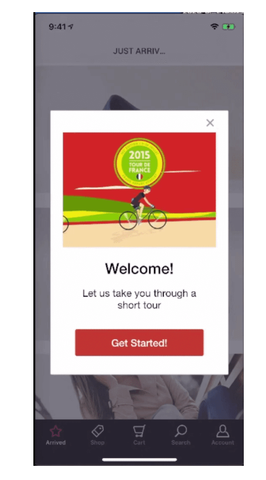
Take the time to think about your “first use” app experience. What do users need to know to be successful? What do they need to do to get started? This will help inform the type and style of in-app guidance you’ll want to offer in the very early stages of your user’s journey.
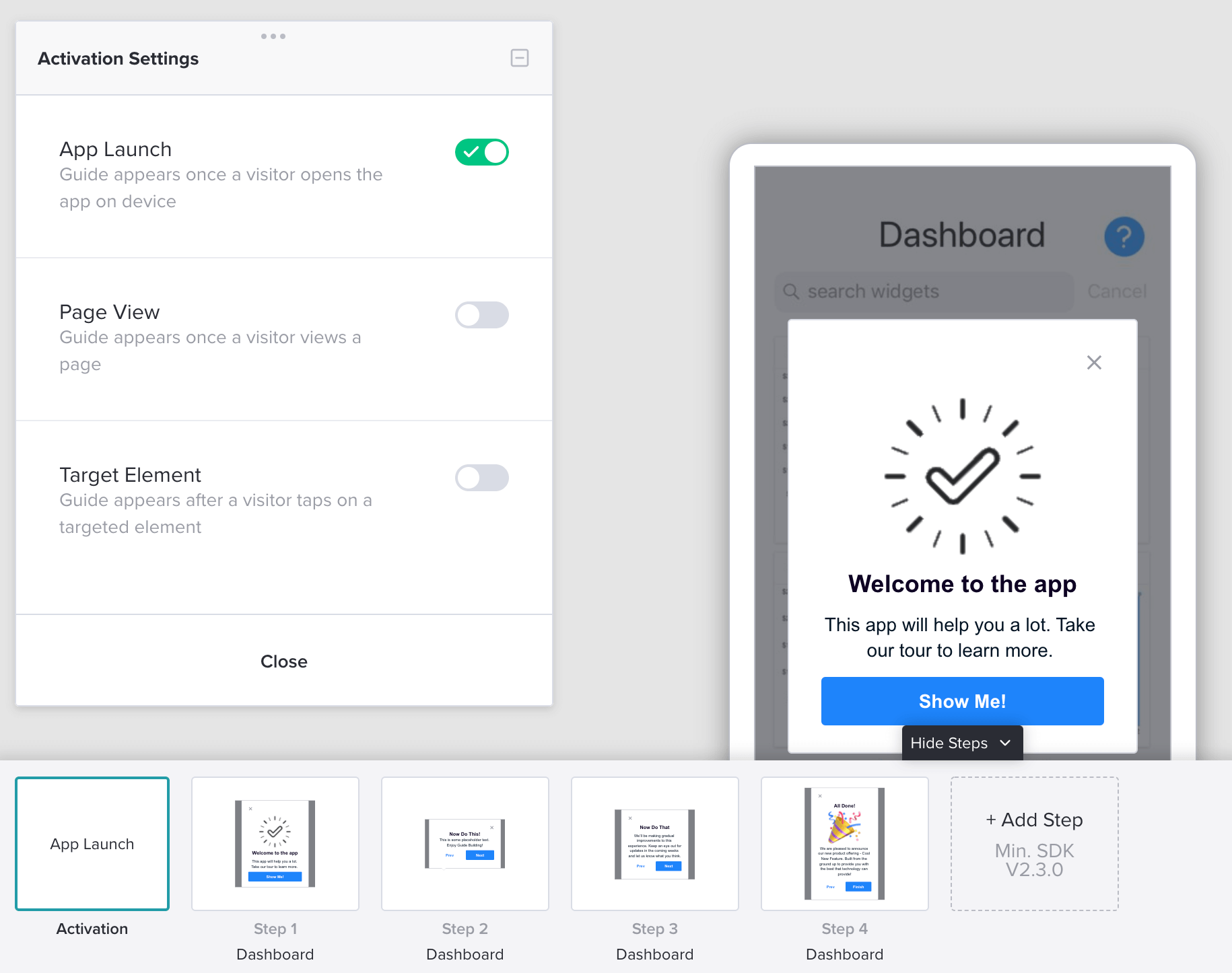
In Pendo, you can build multi-step guides to support new users through their crucial first experience, and launch these guides when a user first opens your app. Combining a showcase of your app’s benefits with a basic product tour is a great way to build users’ confidence.
2. In-app tutorials (“Show me how”)
Tooltip guides are fantastic for steering users through important features and workflows. Short and instructional guides can really enhance a user’s experience, especially if your app contains complex actions where extra support might be needed.
If it’s more appropriate to let your users explore on their own, you could add a “launch” option to your most critical workflows. This will let users have free rein alongside the ability to quickly access guided in-app help when they need it—aka the best of both worlds.
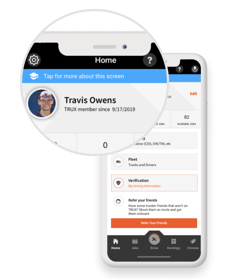
As with all mobile app onboarding, take the time to consider what type of in-app guides are going to be the most appropriate. Think about how tech savvy your users are, what your app needs to help them accomplish, and which areas of your app are the most important for getting users to value.
3. Help new users get set up (“Get me started”)
Finally, many apps require some level of user setup when they’re used for the first time. Guiding a user through this experience to get them started quickly can be the difference between an engaged user and one that deletes your app a few minutes in.
If your app requires any user setup, consider including a short, guided experience to help support users and make them feel good about your app right from the start.
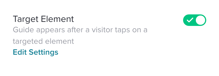
You could also consider adding tooltip guides to “Help” or “Information” buttons. These are non-intrusive and give users a lot of control. When they get stuck or want to understand an area of your app in more detail, this option will allow them to launch in-app help when they need it.
Want to learn more about creating mobile guides for effective mobile app onboarding? Check out this video:
{ "@context": "https://schema.org", "@type": "FAQPage", "mainEntity": [{ "@type": "Question", "name": "What is mobile app onboarding?", "acceptedAnswer": { "@type": "Answer", "text": "Mobile app onboarding is the process of helping users get started with your app in an automated way, so they begin engaging with high-value features right away. Typically, this is done through a welcome guide that walks users through set up and using the core functionality of the app." } },{ "@type": "Question", "name": "Why is mobile app onboarding important?", "acceptedAnswer": { "@type": "Answer", "text": "A good mobile app onboarding process leads to higher software adoption, better user retention, and an overall enhanced product experience. In-app guidance and user analytics can be combined to take this to another level: contextual onboarding (more on that below)." } },{ "@type": "Question", "name": "Is mobile app onboarding necessary?", "acceptedAnswer": { "@type": "Answer", "text": "Not all mobile apps require extensive in-app onboarding programs, though all apps should include some form of “welcome” or user interface (UI) explanation to help users get familiar with the product. A good rule of thumb is to think about the primary goal you want your users to achieve within your app, and to start by focusing only on the areas of the product they need to leverage to achieve that outcome. In other words, rather than showing your users everything they could do with your mobile app (which could overwhelm them), focus instead on showing them the most relevant or important areas of your product that will help them realize value and start seeing returns quickly." } },{ "@type": "Question", "name": "What is contextual onboarding, anyway?", "acceptedAnswer": { "@type": "Answer", "text": "Contextual onboarding is a way to help your new users—or show existing users—new features and workflows in your application. When onboarding is “contextual” it means you’re able to give users the right help at the right time. Instead of showing all of your users the same in-app guides, contextual onboarding allows you to target users based on where they are in their journey to ensure your messages are genuinely relevant and helpful." } },{ "@type": "Question", "name": "What are the core elements of mobile app onboarding?What are the core elements of mobile app onboarding?What are the core elements of mobile app onboarding?What are the core elements of mobile app onboarding?What are the core elements of mobile app onboarding?What are the core elements of mobile app onboarding?", "acceptedAnswer": { "@type": "Answer", "text": "No two in-app onboarding flows are the same—each should be tailored based on factors like your app’s specific functionality and goals, or your users’ levels of proficiency. But as a general rule of thumb, the best in-app mobile onboarding programs contain the following core elements and follow this basic flow. 1. Welcome 2. Feature promotion 3. User set-up and personalization 4. Walkthroughs or instructions 5. Support and helpful resources" } },{ "@type": "Question", "name": "How can I improve my mobile onboarding flow?", "acceptedAnswer": { "@type": "Answer", "text": "The best way to improve your mobile onboarding flow is to track the performance of your existing onboarding programs and use analytics to understand how users are engaging with them. Pay close attention to where users are dropping off or exiting out of your onboarding flow (this could give you insight into how you can simplify), plus how well they’re adopting key features of the app after the fact (which will help you continue to iterate and refine your onboarding “syllabus” and how you deliver the content to users).</p> <p>You can also ask users for feedback on their onboarding experience. A short survey (which ideally also includes space for qualitative feedback) can be a great way to collect user input quickly—and within the context of your app—to allow you to experiment or adjust your approach quickly." } },{ "@type": "Question", "name": "What are some mobile app onboarding best practices?", "acceptedAnswer": { "@type": "Answer", "text": "Providing the best possible mobile app onboarding for your users can mean the difference between higher adoption rates and user retention and first-time users heading for the exit after logging in to find a confusing, frustrating experience. And no two users are the same, so it pays to tailor your onboarding to the context of their individual use cases.</p> <p>Here are eight of the most important best practices for building a successful in-app onboarding experience: 1. Build a guide with a maximum of five steps 2. Brevity is your friend 3. Start with a full-screen guide step 4. Use similar branding 5. Decide whether you want to let your users opt-out of an in-app product tour 6. For longer workflows, show the total number of steps 7. Lead users directly to the new feature’s page 8. Test the tooltip in your guide on a physical device" } },{ "@type": "Question", "name": "What are some common mistakes in mobile app onboarding?", "acceptedAnswer": { "@type": "Answer", "text": "There are a few common mobile app onboarding mistakes to look out for and avoid: 1. Poor guide design 2. Information overload 3. Too many guide steps 4. Content that’s not relevant 5. Not using data" } },{ "@type": "Question", "name": "What are examples of mobile app onboarding use cases?", "acceptedAnswer": { "@type": "Answer", "text": "There are a few different types of mobile onboarding that you can utilize. In practice, most organizations will switch up their approach based on what their end goal is and what makes the most sense for their app and users. You can also combine all three types, of course. Here are three approaches to consider: 1. Highlight your app’s benefits (“Show me why”) 2. In-app tutorials (“Show me how”) 3. Help new users get set up (“Get me started”)" } }] }
![[object Object]](https://cdn.builder.io/api/v1/image/assets%2F6a96e08774184353b3aa88032e406411%2F39f3ccde352b460cbf348ccc952054cd?format=webp)
