How to use Candu and Pendo to build interactive, user-first product experiences with no code
Consumers have come to expect relevant content experiences in nearly every facet of our lives. Algorithms study our every swipe and select. Social ads are scary-specific. Streaming services adapt to our taste—and in some cases, they shape it. And we can tell when our algorithms go rogue, too. (If a road trip copilot has ever “reset” your Spotify recommendations via a DJ session, then you know pain.)
It’s hard to believe that app personalization wasn’t always the norm. Netflix launched its streaming service in 2007 but didn’t introduce “profiles” until 2013. Customers expect user-first experiences from B2C apps; why wouldn’t they demand the same from SaaS products? Hint: they do.
As co-founder and CEO of a no-code UI builder, these are the thoughts that keep me up at night (while I’m scrolling social media). Seriously, nothing kills a first click like a dashboard stacked with irrelevant information. So what’s the answer for SaaS companies? Empower non-technical teams to create no-code experiences on the fly.
No matter how intelligent, algorithms are still code-dependent; thoughtful user experiences (UX) don’t have to be. That’s why Candu and Pendo pair so well. Teams can interlink Candu dashboards and Pendo guides to diversify the message and the medium while redefining user stories in real-time. Users are free to browse (dashboards!) and then to actively learn how to adopt a feature (guides!) when something inevitably catches their eye.
Here are three examples of the power of using Candu and Pendo in parallel:
Interlinking no-code solutions for more considerate UX
Every time a user interacts with your product, you’re having a conversation with them. Like dialogue, interjections are sometimes necessary—but users also need space to listen and to think.
When you think about dynamic UX, consider the cadence and delivery of your content. Every interaction advances the plot. If you assume users want a walkthrough before they’re bought in, they’ll just dismiss it. Engineering teams often lack the resources to nurture these defining moments; UX designers and product managers often lack the skill to code them. The consequence: inconsiderate UX.
No-code UI/UX enables teams to support individualized user flows by delivering the right content at the right time and place—and personalizing it for multiple segments or journeys. Candu’s embedded UI components and Pendo’s in-app guides allow teams to drive desired behaviors without forcing users down a path they’re not into. Building persistent elements that allow users to opt-in to walkthroughs helps create a more thoughtful onboarding experience.
Building frictionless onboarding experiences with dashboards and guides
Like a conversation, good UX is reciprocal. It responds to the user as much as the user responds back. This makes me wonder: Why are most onboarding experiences one-sided when they set the tone for the entire product?
Poorly timed onboarding prompts and stagnant, unoptimized embeds create points of friction; they force interaction based on the lowest common denominator or average user. Most automatic product tours cater to these users, offering a sequence of general information. (“Here’s how someone gets started vs. here’s where you should start.”) Onboarding checklists are a solid alternative, but implement them alone, and they become an assumption: that all users prefer self-serve learning.
Instead, the best method is to draw users to initiate a product tour via a call-to-action within an embedded checklist. Likewise, remind users to finish setup and learning tasks with thoughtful, in-context prompts as they navigate related features. In other words, let your users chart their own course. It’s our job as product managers, marketers, and UX designers to provide the motivation and the map.
Below, you’ll see how CareerPlug diversified key onboarding workflows by interlinking a Candu “Get Started” component on their home dashboard with embedded Pendo guides. They also made sure to create messaging that positions themselves as a mentor rather than a know-it-all.
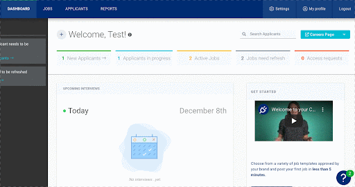
CareerPlug’s use case is just one way to define baseline onboarding UX with no-code solutions. For some product-led companies, it may make sense to prioritize automatic “Let’s get the lay of the land” tours for new users that show off embedded, personalized content. In turn, the persistent components could serve as a hub for guided tours—allowing new users the freedom to find and restart walkthroughs at any time.
In either scenario, newly-nimble teams can now collect data on two interlinked elements and use it to drive conversion and adoption.
Experimenting with in-line UI and walkthrough variants
Drag-and-drop content experiences are only as good as the data that informs them. Candu offers data for optimizing onboarding experiences based on segments; Pendo goes beyond this, letting teams see analytics throughout the full application. With both solutions, teams can implement dynamic content based on an infinite number of personalized journeys.
Together, Candu and Pendo take that data a step further by reducing confirmation bias. If your team only ever uses one format to deliver content, then your product-led growth strategy isn’t truly dynamic—no matter how personalized the message is. The combination of format, timing, and personalization is what separates a compelling experience from an average one.
Candu offers a range of templates with varied components for exactly this reason—so teams can experiment. By adding Pendo to the mix, teams can adapt and interlink no-code variants to build diverse journeys. Without providing both embeds and overlays, you’ll never know the formats that resonate most.