In a recent blog post, we discussed the two primary ways we at Pendo think about driving feature adoption: maintaining adoption for users already engaged with the product or feature, and increasing feature adoption for users who haven’t yet engaged with the product or feature. By breaking this lofty problem into smaller projects with disparate goals, you’ll be able to execute targeted adoption tactics—like in-app guides or integrated campaigns—more effectively.
With that in mind, the next step is to begin measuring the results of your efforts and how they match up against your adoption goals. Like product management, driving adoption is a team sport that requires cross-functional collaboration and constant communication. At Pendo, we use shareable dashboards to do exactly that: document our adoption metrics and strategies, measure our adoption efforts, and communicate results and learnings.
Throughout the rest of this post, I’ll walk through a recipe for building a Pendo Dashboard to collect the data and information required to track product or feature adoption.
Step 1: Document your adoption metrics and strategies
Before you start measuring the adoption of your new product or feature, it’s important to take a step back and ask yourself: What does successful adoption look like? Aligning on a few adoption metrics will help you and your team develop the right tactics to influence those metrics. What’s more, defining these metrics upfront helps provide clear direction for the whole team.
Once success metrics are defined, the next step is to formulate some strategies to help drive adoption and influence those metrics. This is where multiple teams (e.g. product, marketing, and customer success) can come together to experiment and execute different tactics.
Let’s take a look at the components of a recent adoption dashboard we created to measure the success of our latest dashboards capabilities:
テキストブロックウィジェット:成功指標
As shown in the Text Block widget below, we included our success metrics in order of priority at the very top of the dashboard. The beauty of the Text Block widget is that you can communicate information right alongside actual product data. Placing your adoption success metrics at the very top of your dashboard is a great way to anchor teammates around the key metrics you are tracking, and provide a preview of the data to come.
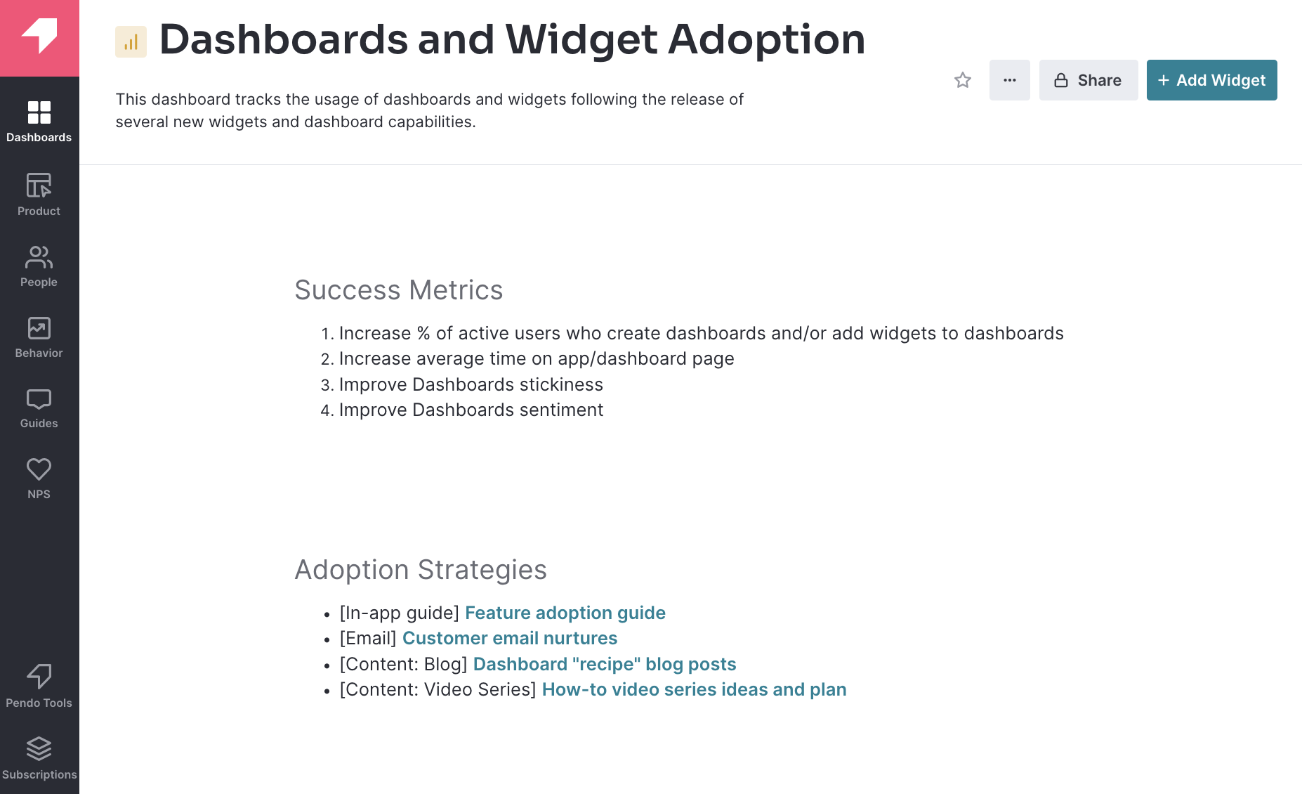
Text Block widget: Adoption strategies and tactics
Below the success metrics, we also included a list of adoption strategies and tactics we planned to use to influence the above metrics. Adding links to plans and the specific assets themselves—including in-app guides or blog posts—is a great way to keep everything organized in one place. We liken it to a one-stop shop with a library of materials that anyone at Pendo can reference.
Step 2: Measure your adoption efforts
Once each tactic has been executed, the next step is to measure your efforts through the lens of the previously stated success metrics. Let’s examine a sampling of widgets in the same example dashboard:
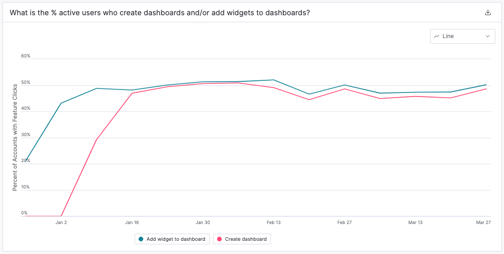
Data Explorer widget: Impact on adoption
Data Explorer is a powerful tool to help you understand product and feature adoption, and at Pendo, we use it regularly to dissect both increases and decreases in usage trends. Bringing this data onto a dashboard via the Data Explorer widget is a great way to get a snapshot of how adoption is trending. In the example below, we’ve started to track our first success metric, the percentage of active users who create dashboards and/or add widgets to dashboards. We can also map the date of when each adoption tactic launched to the chart to see if the tactic influenced overall usage.
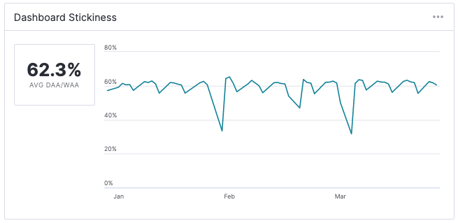
Stickiness widget: Impact on stickiness
Since our third success metric is to improve dashboard stickiness, we’ve also included the Stickiness widget. In your own adoption dashboard, consider tracking stickiness, since a product or feature that is being successfully adopted should be bringing users into your product more often, translating into higher stickiness.
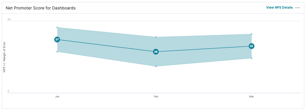
NPS widget: Impact on sentiment
Finally, given our fourth success metric is focused on sentiment, we’ve added a trending chart of NPS for dashboards. Having this qualitative data alongside the quantitative data from the widgets above helps provide additional context on actual user behavior. You can even go one step further and pull in verbatims from your users (e.g. if you asked for feedback using an in-app survey) to understand points of frustration and delight.
Step 3: Communicate your learnings
With all the relevant data available on your dashboard, the final step is to surface and communicate any learnings to the rest of the team. At Pando, we believe this is essential to building a strong experimentation mindset that allows for quick, effective iteration. Let’s take a look at the widgets we used to communicate our learnings:
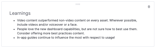
Text Block widget: Learnings
Again, the text block widget is a great way to document and share some succinct learnings.
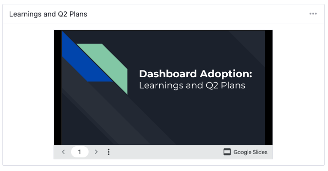
Embed widget: Report on learnings and future plans
For a deeper dive into key learnings, the Embed widget provides a way to include any type of document, whether it’s a slide deck or a long form text file. To help inform the entire team, we’ve included a detailed report in our dashboard that summarizes all the key learnings as well as plans to improve adoption in the next quarter.
ダッシュボードに関するその他のリソースをお探しですか?優れたプロダクトアナリティクスダッシュボードでできることや、Pendoダッシュボードを最大限に活用する方法については、以下の記事をご覧ください。プロダクトに関する喫緊の課題にPendoがどのような回答をもたらすことができるのかを知りたい場合は、新コンテンツ「Pendoのデータで回答できる10の質問」をご覧ください。
If you’re a Pendo customer, use this in-app walkthrough to get started building an effective dashboard of your own. (If you are in the EU instance, access the walkthrough here.)