Think of your product as a high-performance race car. To win, you need more than just speed—you need precision, strategy, and a deep understanding of your competitors on the track.
But without a data-first approach to development, product managers (PMs) act on instinct rather than hard proof. When gut feeling guides your investments, product teams waste their precious time and energy on unwanted features that go unused.
The very best product teams build and collaborate with data at the heart of their decision-making. But what KPIs should you focus on? What do they mean? And most importantly—how do you measure up? What numbers are considered great?
Mind the Product’s interactive software benchmarks are here to help you measure performance, create a data-informed growth strategy, and break away from the competition.
From gut feelings to data-driven decisions: Benchmarks are your product’s pit crew
Data is the most valuable asset in your race to grow. Yet with more tools and KPIs to measure than ever, understanding what to prioritize is no small feat.
Wondering what a good NPS response rate is for a financial application in Europe? Want to see how much your competitors are growing their users? Concerned your users aren’t engaging with in-app guides enough? Answer each and every question that keeps you up at night, in just a few clicks.
プロダクトのパフォーマンスをベンチマークする
Our software benchmarks are powered by anonymized, aggregated data across 6,800 Pendo customers. You’ll be able to view benchmarks for nine KPIs by industry, company size, and region:
- Active user growth: Is your product attracting and keeping new users each month?
- User retention: Are users building enduring habits inside your product?
- Feature adoption: Are users discovering the value of your product and its core tools?
- Stickiness: Do users keep coming back to your product?
- Time to value (TTV): How quickly do users grasp why they need your product?
- Time on app: How long are users in your product?
- Guide engagement: How much do users interact with your in-app guides?
- NPS response rates: Are your customers engaging with your NPS surveys?
- Product engagement score (PES): How are users engaging with the product overall?
Here’s a peek into some key findings:
On average, digital products are growing active users 3% month over month
While an average of 3% monthly active user (MAU) growth may seem low, whether you should actually consider it as such depends on your market’s saturation and the behaviors of your target audience. For the top 10% of large companies, active users are growing 68% month over month. That’s 23x faster than average!
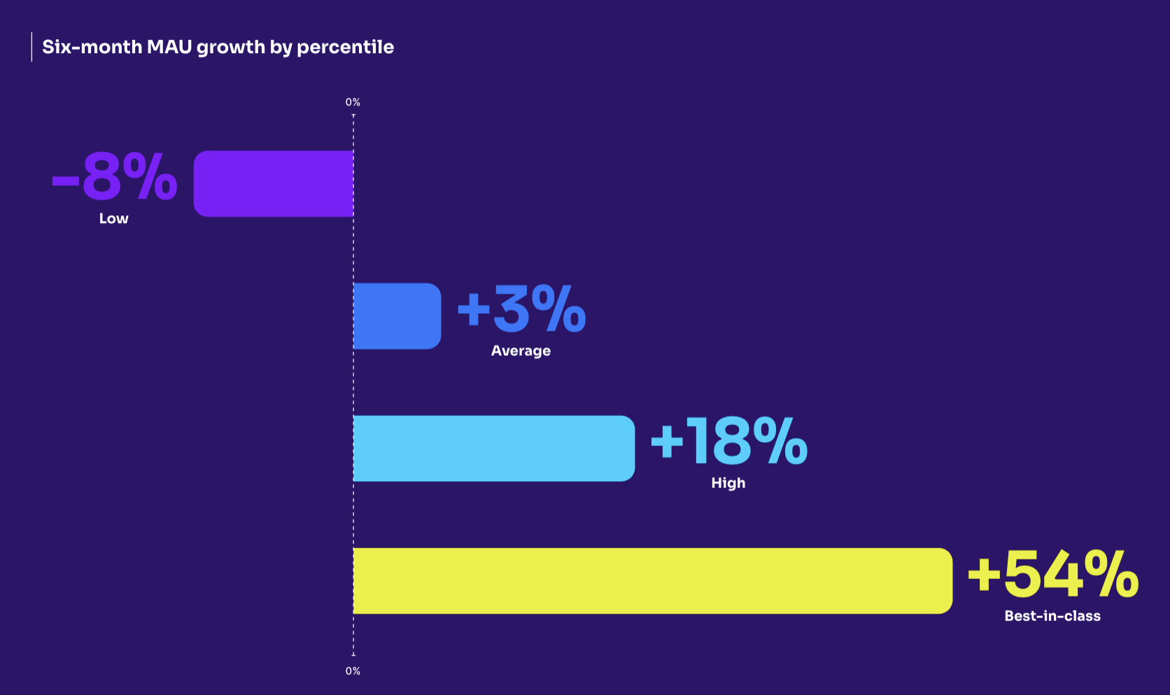
The fastest-growing industries, regardless of region or size, are Manufacturing and Consumer Goods. Meanwhile, Media (-4%) and Government (-5%) are losing the most active users.
Why it matters: A key indicator of product engagement and retention, active user growth can tell you how well you’re adding new customers, and increasing usage with your existing ones. Active user growth also reveals how healthy your user growth is, or if your roadmap needs some adjustments.
6.4% of features are driving 80% of clicks
For every 100 features you’ve built and launched, 6.4 of them are driving 80% of click volume. For best-in-class products, feature adoption jumps up to 15.6%.
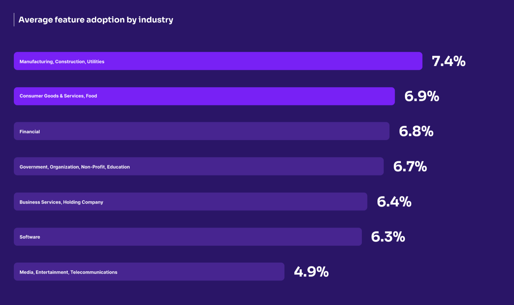
On average, products in the Manufacturing, Construction, Utilities and Consumer Goods & Services, Food have the highest feature adoption rates. Find feature adoption rates for your industry. Industry plays a major role when interpreting this benchmark. For products in Business Services, a 6.4% adoption rate may be a success. However, 6.9% feature adoption for a social media app’s new messaging feature might sound the alarms.
Why it matters: Feature adoption is an activation metric that measures how many users interact with your product’s Core Events, or your most valuable features. By understanding how (or whether) customers use specific features, you’ll get a clear view of if those features are achieving their goals.
How does your product stack up with your peers?
Users spend 2.2x time on web applications over mobile applications
On average, users spend 12.8 minutes on web-based products, and only 5.7 minutes on mobile products.
This may be because of the nature of work performed on web apps throughout a workday—we all know (and may be) someone who bounces between tasks and browser tabs throughout the day. For mobile apps, users are more likely to open your product, perform your task, and then forget about it.
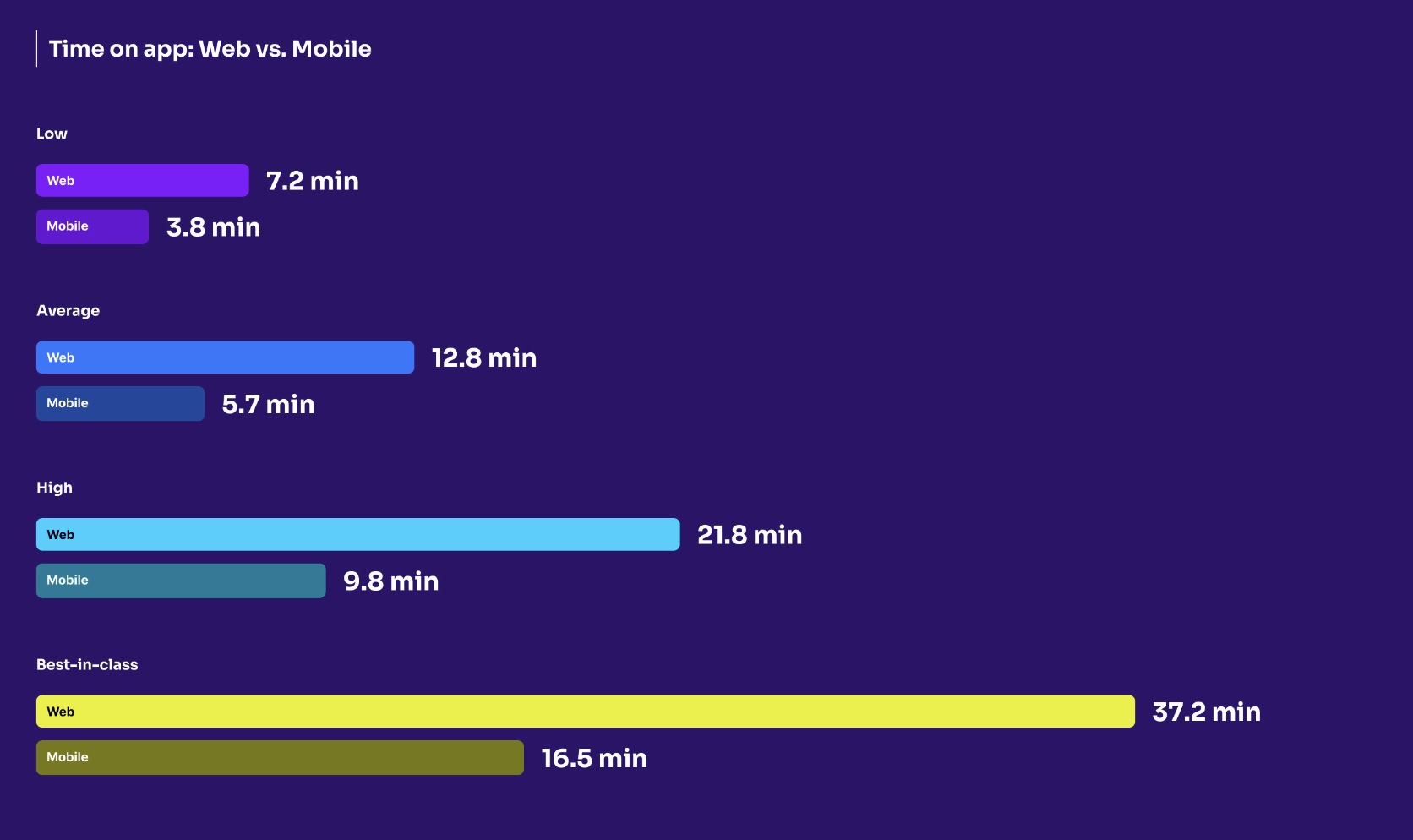
The “time on app” paradox
While a higher time on app isn’t always a positive indicator, you don’t want users ignoring your app altogether. There are multiple ways to understand time on app:
- If you have a higher time on app, that may be because you have a longer time to value, or stronger user engagement.
- If you have a lower time on app, you may have a shorter time to value, or users aren’t finding the app engaging.
Why it matters: The more time users spend with your app (and the faster they get value from it), the more likely they are to continue using your product, and the less likely they are to churn.
The best product teams let data lead their decisions. Use the interactive tool and read the full report to get started.
![[object Object]](https://cdn.builder.io/api/v1/image/assets%2F6a96e08774184353b3aa88032e406411%2F39f3ccde352b460cbf348ccc952054cd?format=webp)