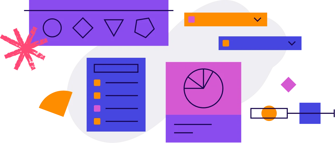
Pendoのデータで回答できる10の質問

買収
User acquisition is the process of converting people into new users–or customers–for your product. For most companies, this metric directly links to revenue growth and is important to continue monitoring over time.

How many new users have we acquired in the last month?
This question will help you understand how effectively you are attracting new users to your application or feature. It’s an important place to start when looking to understand growth for your product.
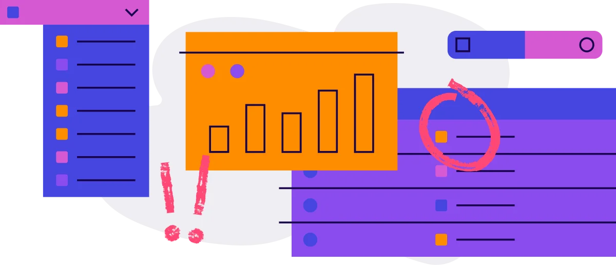
- Navigate to the Behavior tab in the left sidebar, then to Retention.
- Click Create retention report in the top right corner.
- Click “Select activity” to choose the app or feature you would like to see acquisition for.
- For Cohort type, select New accounts or New visitors based on how you’d like it measured.
- Choose a segment that will account for all new users (Pro tip: Segments are defined by a set of rules and provide cuts of data based on a variety of metadata attributes).
- Click “Run”.
- Under the graph shown, click “Chart breakdown” and select “Cohort breakdown”.
- There you’ll see on the left side of the breakdown, how many new accounts or visitors you’ve acquired in each month.
- Increase acquisition of new users by mapping the full customer journey, and seeing what users are doing before signing-up or logging-in to your app.
- Using Pendo’s mapping tools, you can identify where users drop-off during the acquisition process, and understand what actions lead to the most new sign-ups from your website. Learn more here.

アクティベーション
Once you’ve successfully acquired users, the next critical stage of growth is activation: ensuring those users understand your product’s value and continue to use it. Onboarding plays a central role in activation, making it crucial to reduce friction in the in-app onboarding experience.

今日、先週、先月のアクティブユーザー数は?
この質問によって、ユーザーがアプリケーションにログインする頻度を把握でき、プロダクトが人々を引き付け続けているかどうかがわかります。単純ではありますが、プロダクトの使用状況を把握できるため、最初の質問には最適です。
- On a blank or existing dashboard, click Add Widget to bring up the widget library.
- Select the Visitor Overview widget.
- There you will see the number of total active users for today, the number of daily active users (DAU) from yesterday, the number of weekly active users (WAU) from the last seven days, and the number of monthly active users (MAU) from the last 30 days.
- Go to Data Explorer to see how these numbers trend overtime. Further, filter the data by user metadata to understand which user groups generate the most usage.
- You can also view this data by account using the Account Overview widget, which is most applicable for enterprise applications where account activity is more important than individual visitor activity.
How are users moving throughout my app?
This is another way of asking: “What’s the user journey map?” Seeing how users explore your product will start to shed light on which features they’re spending time on, and which areas they’re discovering early on. It also offers you the data needed to understand what they’re navigating to instead of desired events.
- Navigate to the Behavior tab in the left sidebar, then to Paths.
- Select the page or feature from the relevant app that is a natural starting point for a user first coming into your product.
- To start, keep the setting of showing paths that are “Starting from” the selected page or feature.
- Choose the date range and segment, or user cohort, you’d like to view for this path.
- Click Save & Run and name this report.
- Now that you see where many users start and end, take those two points and navigate to Workflows within the Behavior tab to see what they’re doing in between.
- Click “Create workflow” and set the beginning and end points as the Starting and Ending events.
- Adjust the date range and segment as needed, then click “Save and run”.
- Select the “Journeys” tab under the header to see a breakdown of the user steps between those points. Here you’ll see Top journeys, or can filter through all journeys.
- Curious to know if users are actually doing your “happy path”? Navigate to Funnels in the Behavior tab and enter each step of your happy path to analyze conversion.
- Include a Guide or step of a Guide within your funnel steps to see if it has any impact on moving users through your specific process.
- No matter the mapping tool, view user journeys by different persona segments to understand if one group is moving through the product differently than another.
プロダクトのコア(主要)となる部分はどこですか?
ユーザーが最も使用しているのはどのフィーチャーですか?
プロダクトの使用状況を大まかに把握できたら、焦点を絞って、ユーザーにとってどの部分が重要か、そしてそれが期待に合っているかの検証を開始します。これらのフィーチャーは、ユーザーが問題を解決するために使っているものを表しており、オンボーディングとプロダクト体験全体が正しい行動を促しているかどうかを理解するのに役立ちます。
- From any dashboard, click Add Widget to bring up the widget library.
- Select the Feature Adoption widget to see which features are driving the most interaction in your product.
- Adjust the settings (date, segment, app) based on your needs (Pro tip: For the “Benchmark” setting, we recommend following the 80/20 rule and starting with 80% of feature clicks).
- Take note of the most-clicked features, and if those features are in a specific area of the product—this indicates that this part of the product may be the most valuable for your users.
- Click Save & Run, and give this report a name.
- Click on any feature in the table to view data for that specific feature, including the top visitors and accounts and the feature’s activity trends.
- If you’ve set up Core Events, compare the list of most-used features to your list of Core Events to see if users are accessing the areas of the product you believe are most important.
- Go to Data Explorer to uncover your most-used events, and add that report to your dashboard for monitoring. Here, you can also analyze by most-used within a certain product area rather than your product as a whole.
ユーザーはプロダクトの重要な部分をすばやく簡単に見つけることができていますか?
ユーザーがプロダクトをどのように使用しているか、プロダクトの最も重要な部分が何であるかがわかったので、次は、ユーザーがこれらのページやフィーチャーをできるだけ簡単に見つけられるようにする必要があります。オンボーディング(およびアクティベーション全般)を成功させるためには、ユーザーにプロダクトの価値をすばやく簡単に見出してもらう必要があります。さもなければ、ユーザーに再び使ってもらう可能性は低くなります。
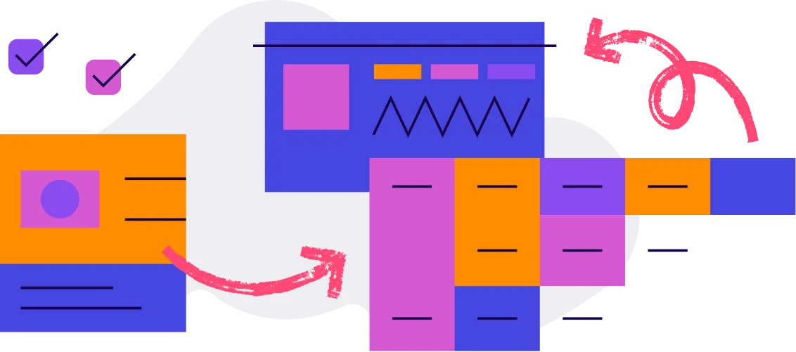
- From any dashboard, click Add Widget to bring up the widget library.
- Select “Time To First Use” widget to understand how quickly visitors first engage with your key events.
- Adjust the settings (date, segment, app) based on your needs, then click “Save”.
- Take note of which event takes the longest for users to engage with, which may indicate that it’s difficult for users find, or that it isn’t as important as you previously thought.
- Compare different user segments to see how time to first use changes—you can even compare against a segment of your most engaged users and use that as a benchmark to work towards.
- Take note of any events that show an increasing trend (indicated by the red up arrow) and investigate what tactics (or lack thereof) may be causing the increase in time.
- For a better understanding of the time it takes users to get to this feature or complete an action or process, use Funnels or Workflows in the Behavior tab.

アダプション(定着化)
定着しているプロダクトであれば、ユーザーがすばやく価値を発見し、リピーターとなり、プロダクトが日常生活の一部となることで習慣的な使用が促されます。プロダクトの使用状況データは、プロダクトがこの基準にどの程度適合しているかを判断するのに役立ち、プロダクト体験を継続的に改善するための実用的なデータとして活用できます。

主要なフィーチャーの使用は時間の経過とともに増減していますか?
顧客がプロダクトを使い続ける中で、主要なフィーチャーを継続的に使っていることを確認する必要があります。主要なフィーチャーは、定着化や肯定的な顧客センチメントなどの結果と相関関係があります。
- From any dashboard, click Add Widget to bring up the widget library.
- Select the Page/Feature Use Over Time widget to see trending data on page and feature activity.
- Adjust the settings (date, segment) and select the pages and features you’d like to track.
- Select the appropriate metric based on what’s most important for you to measure—Views/Clicks, Visitors, or Accounts.
- Take note of any dips in page or feature usage and start to formulate potential hypotheses for a decrease in activity.
- Use the Data Explorer widget to compare page and feature activity over time for different segments or time periods.
- If you have a mobile app, you can also use the Data Explorer widget to compare web app usage against your mobile app to understand feature usage holistically.
ユーザーが問題を抱えているフィーチャーやページはどれですか?
ユーザーがプロダクトにどのような価値を見出しているかを把握した後は、逆に「ユーザーはどこで行き詰まっているのか」に目を向けることが有効です。このようなユーザーは、さまざまな理由でワークフローに摩擦を感じている可能性があります。たとえば、何を求めてこのプロダクトたどり着いたのか、どのようにプラットフォームを操作するのかがわからないなどです。
- Navigate to the Behavior tab in the left sidebar, and then to Funnels.
- Begin building your funnel by selecting the series of pages, features, or track events that you’d expect a user to engage with in sequential order.
- To start, we recommend looking at the most common flow that applies to the broadest set of users.
- Select the date range and segment based on your needs.
- Click Save & Run, and give your report a name.
- With Session Replay, navigate to Replay in the leftside menu, then select Library.
- You can search for replays by a specific app, feature, or page. Add a filter to analyze for a specific Event, Frustration type, or Duration of time.
- Suggested replays at the top will call attention to the events with the most rage clicks based on your search parameters, along with the events most-trending down or up in usage during that time.
- You can begin watching replays and getting an idea of where users are getting stuck, or navigate to Data Explorer in the Behavior tab to identify common frustration trends.
- In Data Explorer, click “Create Data Explorer report”.
- For “Select events,” click “Select all” for the app or apps you are searching for frustration in. Make sure “Track Events” is deselected from the activity types included, then click Apply.
- For “Measure by” scroll down and choose the frustration metric you’d like to see trends for. Adjust the segment, date range, or report filters as desired. Then click “Run”.
- You’ll see in the chart and Breakdown how many Rage clicks, U-turns, or Error clicks occurred depending on what you measured by.
- With Session Replay and Data Explorer, you can also compare frustration metrics by different user segments or by different features and apps.
- If it’s a step within a process that users are struggling with, be sure to map it using Funnels or Workflows. This will allow you to pinpoint where drop-off is occurring and for what users.
ユーザーが無視しているフィーチャーやページはどれですか?
これにより、プロダクトのどの部分がユーザーにとって無関係なのかを把握でき、フィーチャーの肥大化の回避やサポートコストの削減のために、最終的に廃止したいフィーチャーを明確にすることもできます。ユーザーがどのフィーチャーを最も使用しているかを把握するのと同様に、プロダクトの効果的な使用の妨げになっているフィーチャーがないかを確認することも重要です。
- On a blank or existing dashboard, click Add Widget to bring up the widget library.
- Select the Feature Use by Visitor.
- Enter the date range, segment, and app you’d like to analyze usage for.
- Click Save.
- Now you see at a glance, which features or pages have the lowest visibility.
- Take note of any pages or features that have no activity over 90+ days, as these may be good candidates for a potential sunset.
- Compare and contrast the above set of pages and features against your mobile app and consider a tandem sunset.

リテンション
特に、顧客獲得にかかるコストが初期契約額よりも大きい場合、プロダクトがユーザーを維持できるかどうかが企業の収益に直接的な影響を与えます。プロダクトアナリティクスによって、自社の状況を把握し、リテンションの取り組みに重点を置くべき場所をより明確にすることができます。

アクティブユーザーはどれくらいの頻度でプロダクトを使用していますか?
この質問に答えることで、プロダクトの通常の使用頻度が明らかになり、ユーザーセグメントやペルソナ間の使用パターンの違いを把握することもできます。最も重要なのは、時間の経過に伴う行動の変化を監視できることです。
- From any dashboard, click Add Widget to bring up the widget library.
- Select the Stickiness widget.
- Configure the Metric setting to best represent ideal usage for your product (For example, DAU/WAU for an enterprise application since it’s typically used on a weekly basis).
- Adjust the other settings (date, segment, app) based on your needs.
- Take note of any unusual dips in the chart, and be sure to track average stickiness over time to see if it’s slowly increasing.
- To see what your ideal stickiness should be, add a segment of your healthy customers (you will need to define what “healthy” means for your business) to the Stickiness widget, then compare that to your average stickiness.
- If you have an accompanying mobile app, compare its stickiness against the web app and take note of any differences.
重要なフィーチャーを使用したユーザーのうち、どれだけの人が戻ってきますか?
Start by analyzing retention at the app level to know if your product is drawing users back consistently. Next, it’s useful to examine retention at the feature level, and specifically at an individual feature’s ability to keep users engaged. Ideally, the features you believe add value to the user experience will also correlate with continued usage of your product.
- Navigate to Behavior, and then to Retention to view the Retention chart.
- In order to understand feature retention, select a specific page, feature, or track event under the Source setting (instead of All Activity).
- In the Cohort Settings, select the Cohort Type and Size relevant for your product.
- Adjust the segment and date range as needed.
- The chart now reflects retention filtered by activity of the selected page, feature, or track event—take note of the impact of the selected page, feature, or track event on user retention.
- Continue to select other features that you believe are high value—if they show low retention, you may want to consider using in-app guides to improve discoverability.
- If you’ve recently launched a new feature, use the Retention chart to see if it’s helping to increase overall user retention (If it’s showing high retention, the feature may be a strong activation point that you want to drive new users to during onboarding).