One challenge that comes with this is knowing what matters at the right level of leadership. Executives everywhere are busy, and they don’t need the nitty-gritty details to do their jobs well.
That’s why our Product Operations team tackled this head-on: Building a system of dashboards designed specifically to support strategic decision-making at the executive level, without diluting the valuable work done by our product teams.
This is the story of how we distilled a rich landscape of product analytics into three highly curated dashboards, each reviewed on a regular cadence by our Senior Product Leadership Team (SPLT), to create clarity, alignment, and action.
Psst — You can also explore our dashboards in-depth in this free slide deck.
1. Global Betas: The source of truth for innovation
When you're running multiple beta programs across products, teams, and time zones, it's easy for key metrics to get lost in the shuffle.
We created the Global Beta Dashboard to solve this challenge: bringing critical active betas into one place, with a consistent framework for evaluating progress and performance. The dashboard filters out noise and highlights only the betas that require senior attention, while the full analytics remain available for product teams in our broader reporting environment.
Each beta section doesn’t always look exactly the same. Most widgets are consistent, but not always. When needed, be flexible enough that you can add in any key relevant differences, and add in explainer text for your audience.
Why this matters to execs
This dashboard shows up every week in our Senior Product Leadership Team (SPLT) meetings, ensuring that betas don’t linger without direction, and you know if they’re working, they need a pivot, or they’re ready to scale.
What’s in our Global Beta Dashboard
The top of the beta dashboard includes a global beta summary report.
We embedded a custom report from our R&D reporting tool (from Airtable), which gives a list of all current betas by product area and lists their health status, launch level, days in current phase, and a link to the full beta analytics dashboard in Pendo for quick reference.

Then, each beta loosely follows the STARS framework, providing a structured way to assess success:

Here’s what this looks like:
Raw number of customers in beta
How many accounts are participating in the beta?
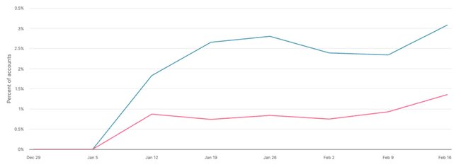
Account usage trends (blue line)
How many accounts are actively engaging with the new capability? For the beta dashboard, this will look at a short window of time, usually the past 30 or 90 days. For “using,” we’re looking to see if they start the process. Did users run a report or search within Listen Explore? Did users select a template when creating a new dashboard for Dashboard Templates?
Value realization trends (pink line)
Are those accounts achieving meaningful outcomes, beyond clicks and visits? Did users take an action on the search results (ie create an idea or add it to the roadmap) within Listen Explore? Did users customize the dashboard template and save it to their dashboard?

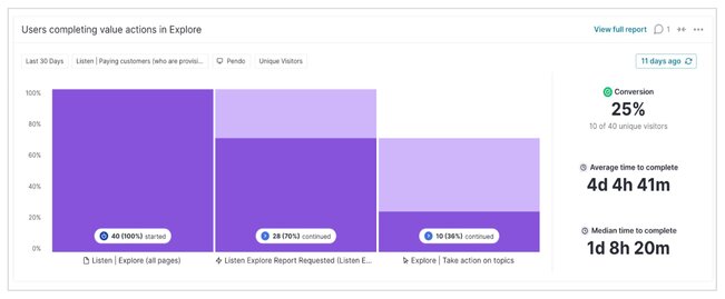
A key metric we pull from the beta dash is the percentage of customers who are achieving meaningful outcomes from the feature. We use a funnel for each beta to easily see this usage to value “conversion” rate.

Feedback sentiment
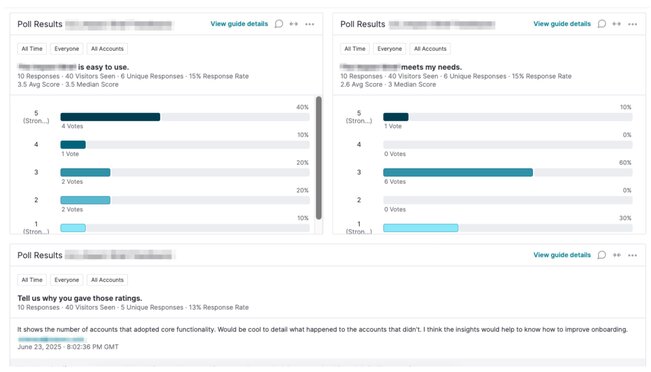
What are users actually saying, and how does it shape our next steps? All of our betas use a feedback badge, and we bring those feedback results (both qual & quant) into our beta dashboards.

2. Launch Success: Measuring what matters post-GA
Shipping a feature does not equal success (or that your work is done). True impact comes from adoption and value realization, and Pendo’s quarterly Launch Success Dashboards help us drive that accountability after a feature enters General Availability.
Why this matters to execs
This view helps leadership standardize and compare launch performance across vastly different product areas. Whether we’re releasing a messaging feature and an analytics module, leadership can evaluate everything on equal footing.
What’s in our Launch Success Dashboard
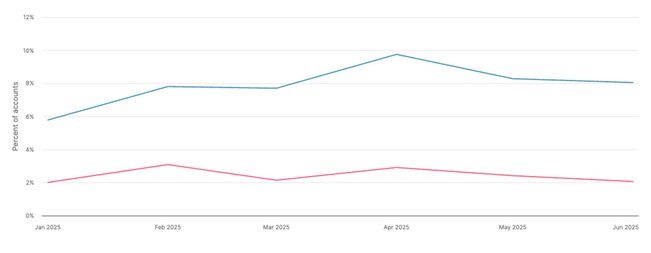
While every launch has a detailed analytics dashboard available (using our feature launch dashboard template), we created one unified, executive view that simplifies key launches down to two critical measures:
- % of eligible accounts using the feature in the past 180 days.
- % of eligible accounts getting value from the feature (e.g., completing key value indicating actions).

You’ll notice this is the same widget we used in our beta dashboard, with a longer timeframe and grouped by month. Save the effort and reuse it in this dashboard after launch!
3. Product Leader Overviews: Your weekly portfolio pulse
Product leaders juggle a wide range of priorities. To keep them updated on what’s moving the needle without digging through dozens of dashboards, we built the Product Leader Overview Dashboards. (Of course, they can always go deeper into specific product areas from the main dashboard.)
Why this matters to execs
These dashboards elevate leadership conversations from status updates to strategic decisions. They make it easier to spot trends, address risks early, and align investments with what’s delivering value, before it’s too late.
What’s inside our Product Leader Overview dashboards
The top of each Leader dashboard includes a global section with three key widgets:
- Relevant portfolio links. These include links to each product area’s overall health, adoption, Salesforce, and other key dashboards across various tools
- Global links. This includes our product team roadmap, global beta dashboard, annual launch dashboard, and other links for quick access.
- Off-track launches. This is an embedded view of a custom Airtable report of any launches that are off track or at risk each week for discussion.
Under the global section, each product area (Analytics, Guides, etc) has its own section which includes:
- North star metric: This is the high-level goal for the entire product area, like “Increase the number of Monthly Active Enterprise Users in Pendo” or the WAU/MAU stickiness metric.
- 3-4 key drivers: Since the North Star metric is usually a lagging indicator and we don’t expect it to change drastically from week to week, we also include key leading indicators that are predictive of success. These metrics are chosen specifically for their ability to impact the North Star metric over time and are usually quarterly targets for product teams.
- Key recent launches: Early signals of performance from new features. This section is built around the same STARS framework that we used for betas in the previous section.
Tips to ensure your dashboards actually get used
There are plenty of ways to approach dashboards at all levels of your product team. Here’s why these are effective for our leadership team:
- Purpose-built dashboards: Each dashboard maps to specific, recurring leadership decisions.
- Embedded within workflows: They’re reviewed during our two-hour SPLT meetings every week—rarely with exceptions.
- Backed by depth: Each view links out to our more detailed analytics dashboards when deeper exploration is needed.
- Maintained by Product Ops: We keep it lean and focused. Product Ops curates the view so leaders can stay focused on direction.
- Support autonomy: These dashboards complement, not replace, the deep analytics owned by each product team.
Getting started at your company
The Product Ops team’s goal wasn’t to reduce the number of dashboards we use. Rather, we wanted to elevate the visibility of what’s impacting business outcomes, with the right level of detail for our leadership team.
To do the same at your company, follow these 4 steps:
- Start by auditing which metrics your leadership is missing in their existing meeting cadence.
- Identify the key decisions leaders make every week or quarter.
- Build dashboards that speak directly to those needs.
- Embed dashboard reviews into existing meetings. This is key!
Getting to this point took iteration. Here’s what we learned, and a few tips to make this work for your own team:
- Focus on what’s essential, not exhaustive. When reporting across many products, curation is key to keep maintenance low and clarity high.
- Executive sponsorship is key. Without buy-in and regular use, dashboards gather dust.
- Templates create consistency. Each product team aligns to a similar reporting structure, so leadership isn’t comparing apples to oranges.
- Automation is here to help. We use Airtable notifications to trigger dashboard updates. For example, when a L1 or L2 launch reaches GA, Product Ops gets a notification to move the relevant widgets from the beta dash over to the launches dash.
- Quarterly tune-ups keep things relevant. Because dashboards evolve with business priorities, we review and refine them with leadership every quarter.
Pick the leadership pain point that causes the most confusion or delay, and build your first dashboard to solve for that. Good luck, and happy reporting!
![[object Object]](https://cdn.builder.io/api/v1/image/assets%2F6a96e08774184353b3aa88032e406411%2F39f3ccde352b460cbf348ccc952054cd?format=webp)


