User engagement is always a good thing, right? Right! Engaged app users have higher LTV and are better for your bottom line. But nurturing engaged users is an art, and even good intentions can sometimes yield mixed results. As you start planning an in-app engagement strategy, here are some tips on what NOT to do. And just to be helpful, we also offer some inspiration for things you could do.
Location, Location, Location
An app screen is precious real estate — you want to make sure that whatever message you have for your users is well received.
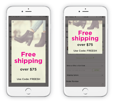
Say you want to give users a special coupon for free shipping; make sure that the coupon is displayed only when they’re ready to check out, and when it’s clear where they’re meant to enter the code. Showing the coupon while they’re still browsing and covering the whole screen is probably just annoying, and requires them to remember the coupon throughout the process.
Push with Personality
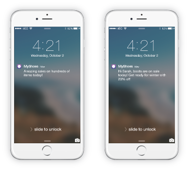
Specials sales and promotions are a great opportunity to draw users 
Take the example on the left, it is so generic as to be spammy. If you’re using push notification, make sure that messages are personalized and offer specific value to the user based on their past behavior.
Timing is (almost) Everything
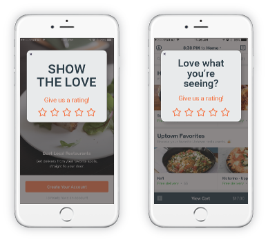
User feedback on your app can be important for the success of your business, but knowing when to ask is almost as important.
Don’t ask for feedback before a user has had the chance to enjoy the app, it is just going to turn them off and leave the app (or leave a bad review). Instead, ask for feedback once they’ve been browsing for a while, perhaps after completing an action, or at another milestone that gives you indication they are enjoying the app.
Take No for an Answer
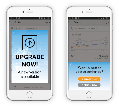
Sometimes, even if you’ve asked nicely at the right time and place, users just want to ignore the message. That’s okay. Because
In the example on the left, you’ll see that the design is intrusive and it’s hard to figure out how to close the message. The second message gives the user two ways to get out of it, making it more palatable.
Like all marketing efforts, in-app marketing is partially about trial and error. But that doesn’t mean you have to make a lot of mistakes before you get it right. Use the tips above to avoid the pitfalls, and schedule a demo today to see how Insert can help you launch campaigns in your app today!


